Event Branding
As the marketing hub for promoting and expanding tourism within California, Visit California is a nonprofit organization that never loses steam. With constant programs, promotions, and events, California remains bustling with energy, thanks to Visit California’s efforts. From travel inspiration to road trip checklists, the golden state is endorsed for its vacation versatility.
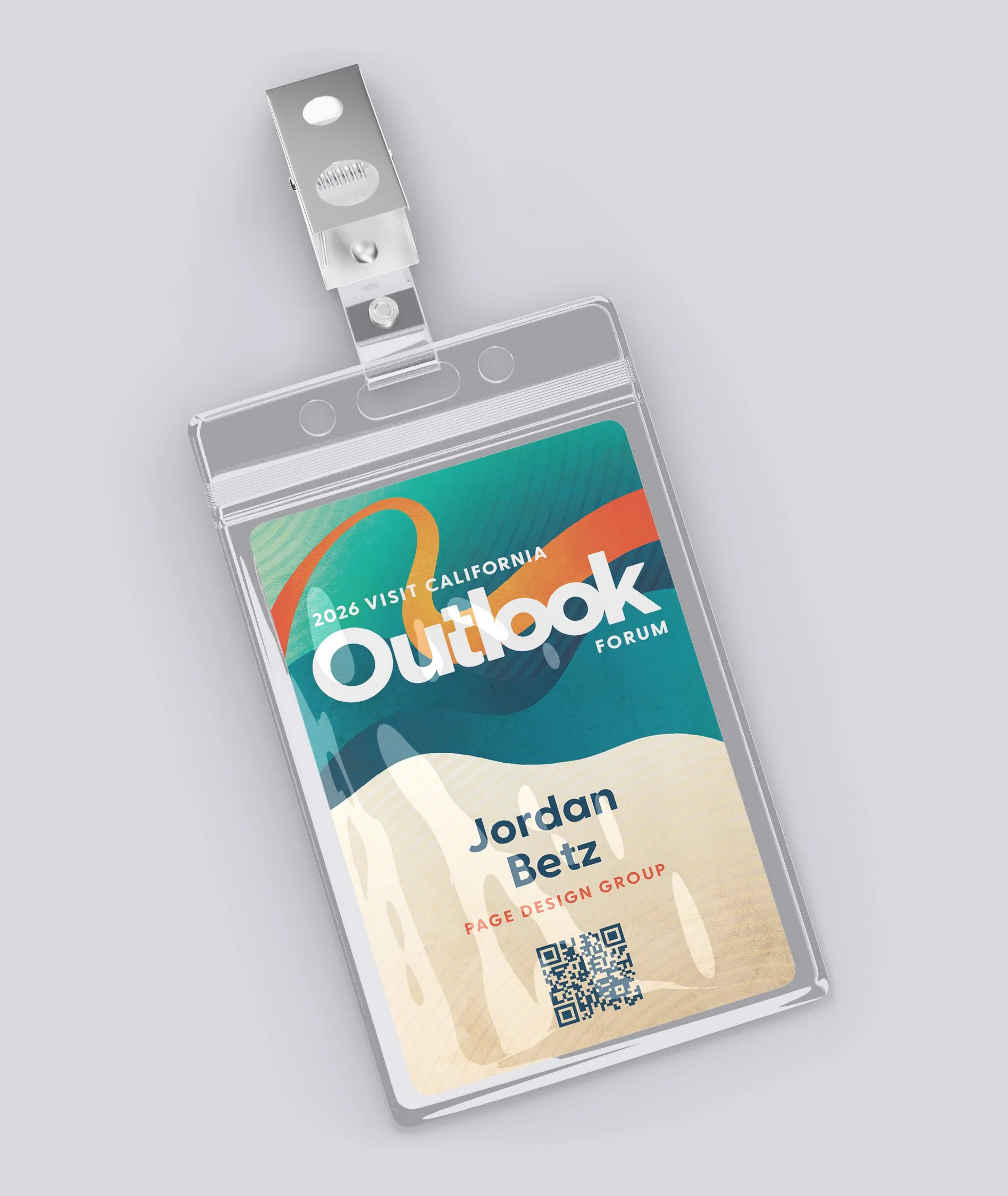
Each year, Visit California hosts its premiere event, Outlook Forum, to gather attendees from all over and look towards the future of California’s tourism goals and achievements. This occasion is held in a different city each year and requires an expansive list of designed materials to enhance various parts of the venue space. From stage designs and name badges to window clings and agenda signs, the event becomes a fully immersive experience for each guest.

The Goal
For the 2026 event, Chula Vista was chosen as the host city. Outlook Forum’s design needed to embody the coastal region within San Diego County, whilst still emulating key aspects of Visit California’s brand. With the direction of “sun, surf, and sand”, we sought to create an adaptable composition that conveyed confidence and optimism for California tourism.
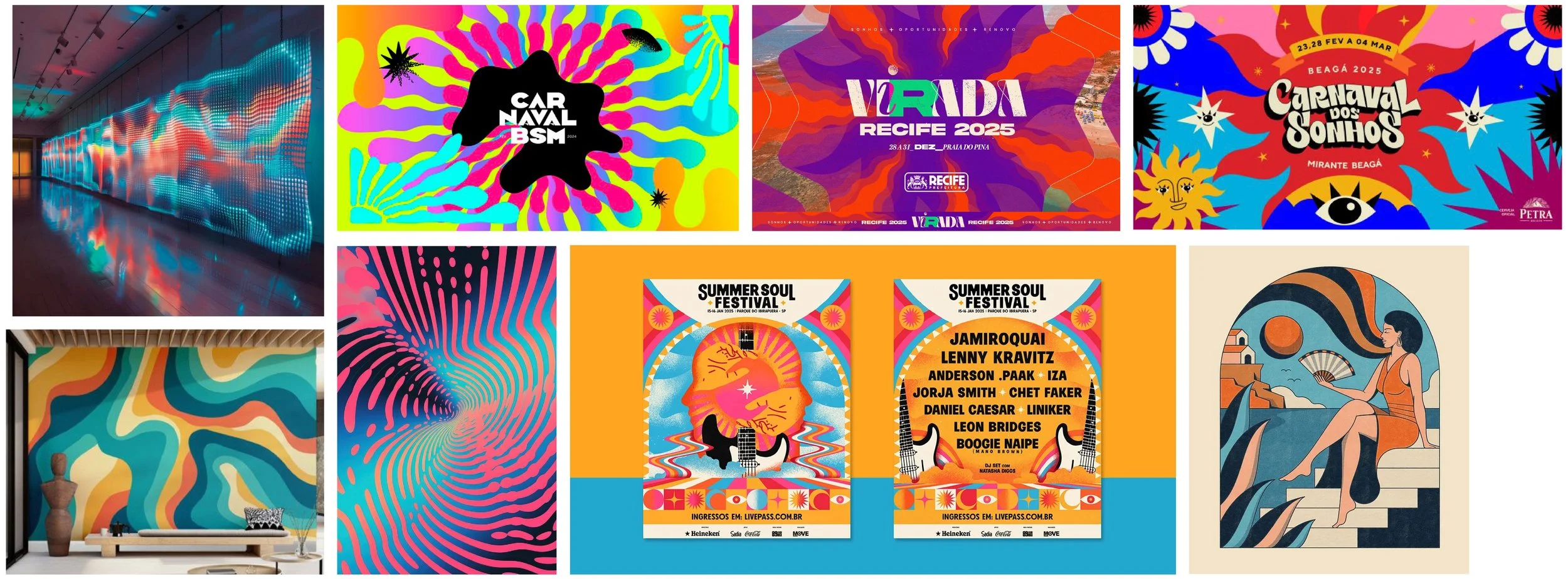
This concept drew inspiration from festivals and promotional materials rich with color and movement. Designs that included subtle textures that enhanced simple shapes and forms were added to the mood board. An interactive element was also at the forefront—how do we include something that guests could potentially engage with and influence into the design? Each attendee’s potential experience kept the possibilities flowing.
CONCEPT INSPIRATION
The Solution
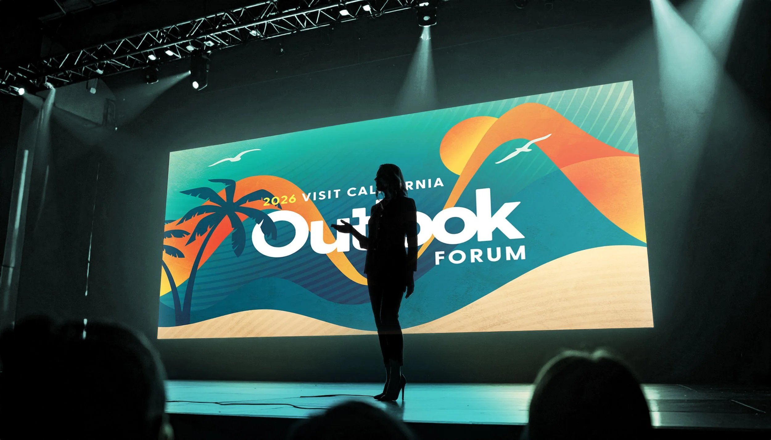
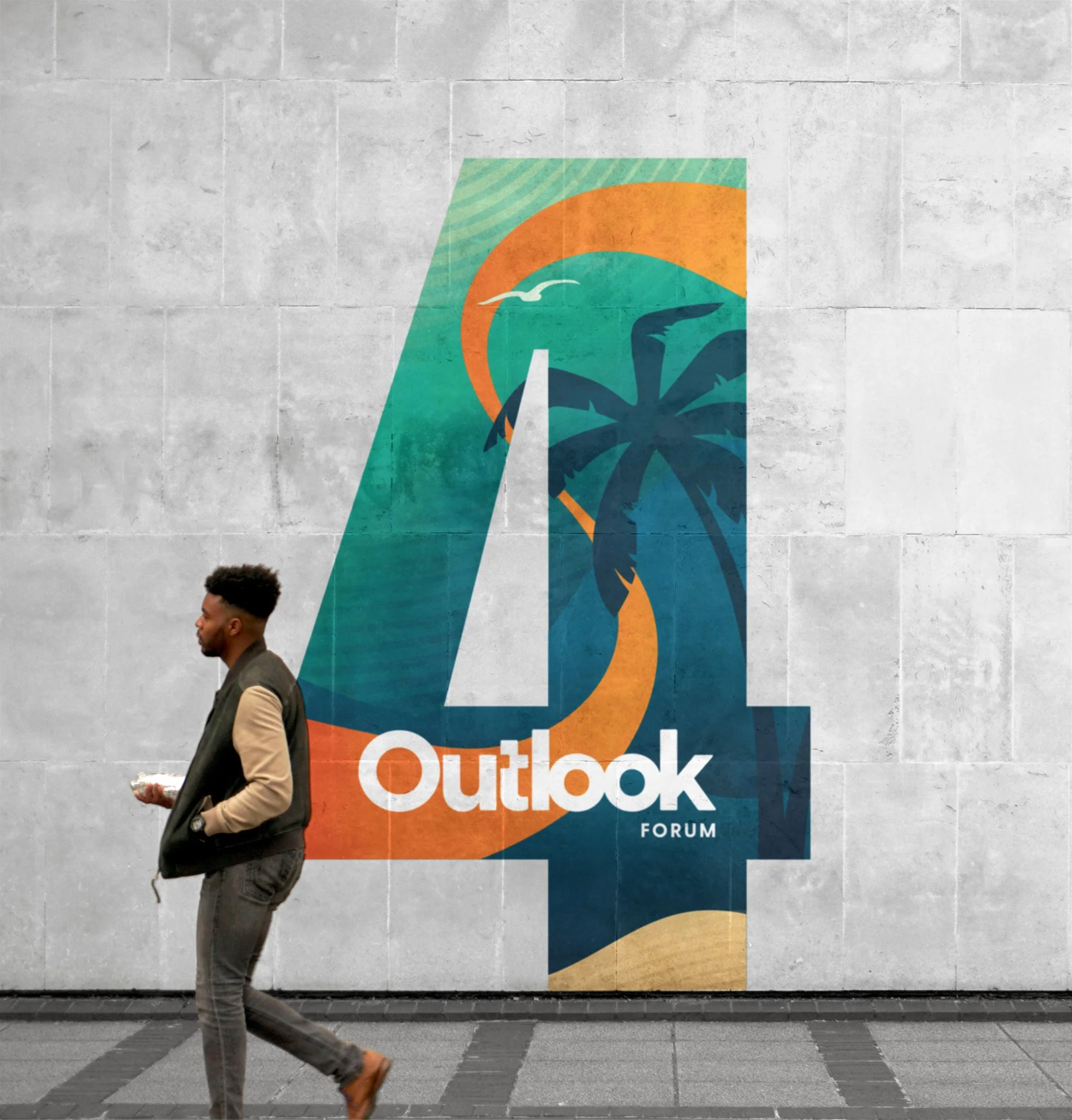
Abstract shapes and forms are utilized to convey the flow of energy amidst Chula Vista’s calm and serene, yet playful, coastal environment. The radiating lines, organic forms, and oceanic colors illustrate the geographical makeup of the southern Californian coast. Warm oranges and lively seafoam greens breathe life into the system. These varying tones combined with a soft texture add gradual depth and dimension to the seascape. Minimal iconography with the palm trees and seagulls provides geographical context and establishes an inviting presence to the event.
The rippling water waves fall back behind the rolling hills and sandy shores, as a vibrant orange band radiates from the sun. This ribbon symbolizes a “finish line” banner, highlighting the celebration of past accomplishments and excitement towards future endeavors. The different forms and shapes also represent each attendee’s influence of all travel and tourism achievements—“influencing the wave”. Each individual has shaped the opportunities that are now being celebrated.
STAGE DESIGN
COLOR PALETTE

NAME BADGE
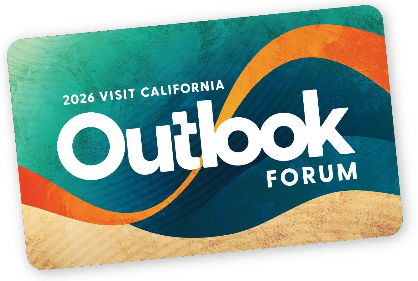
KEY CARD
WINDOW CLING
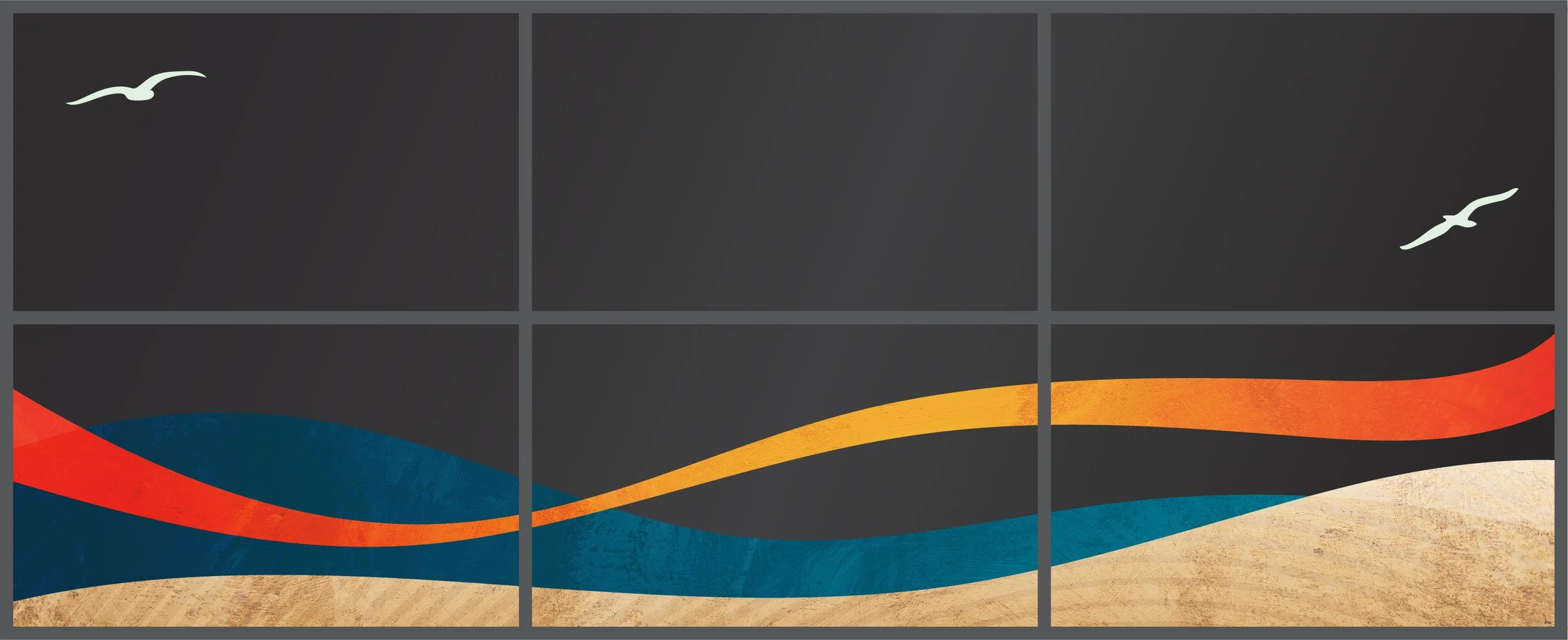
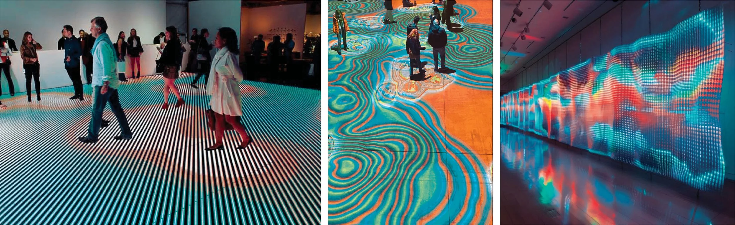
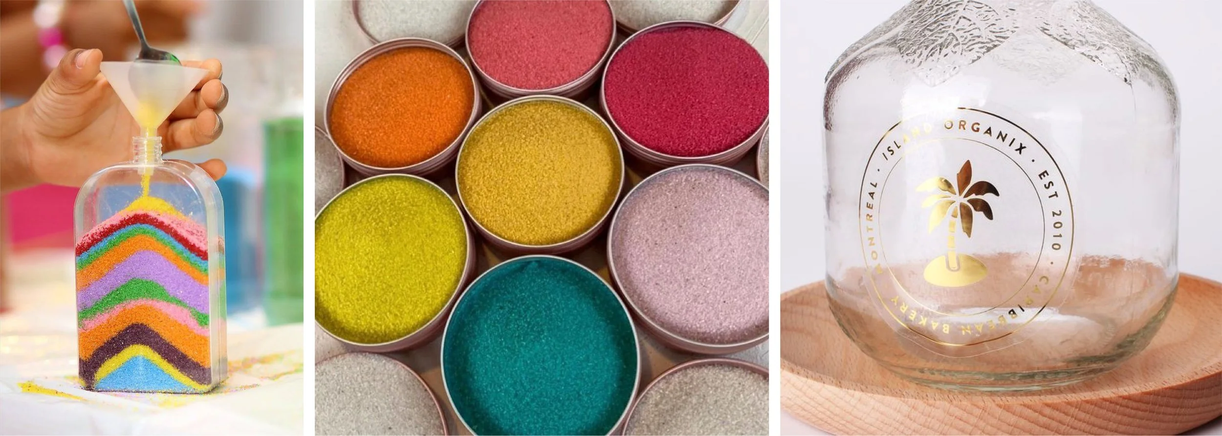
The implementation of these organic forms allows for ample flexibility and versatility across all possible collateral pieces. Each design can feel independently unique whilst remaining visually consistent within the brand. Fillable sand bottles with each color denoting a vacation type/style are proposed as an icebreaker activity to prompt guest conversations at the event. Attendees could also interact with projection mapped waves onto the floor to further push the idea of “influencing the wave”.
Overall, this concept allows for Chula Vista’s sense of spirit and adventure to prominently accentuate the celebratory festivities. From the soothing waves to the kinetic rays, each attendee is reminded of their role in inspiring possibilities and the passion behind California’s tourism.
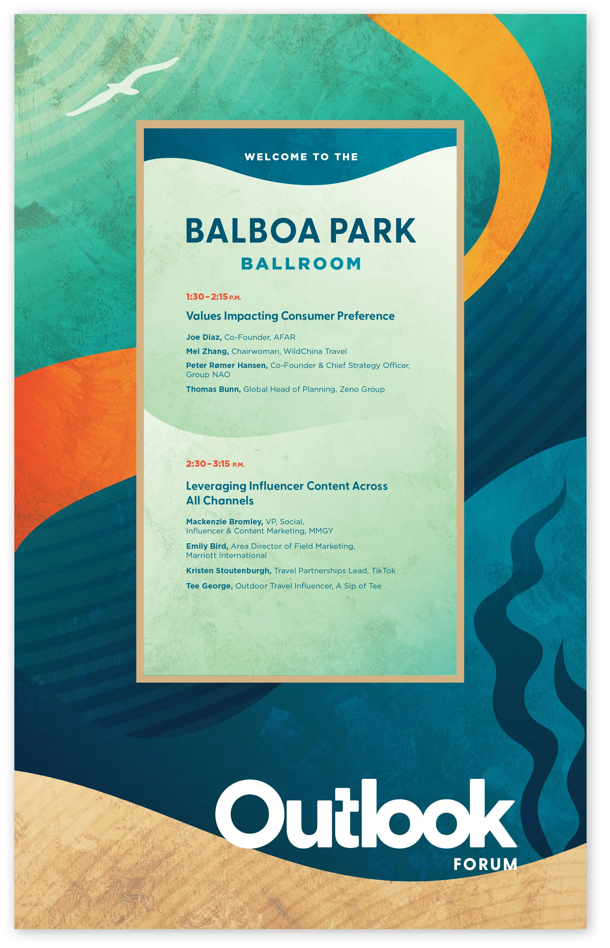
AGENDA SIGN
HOTEL FLOOR NUMBER
Experiential Components
CUSTOM SAND BOTTLES
WAVE PROJECTION MAPPING