Brand Refresh
With over 40 years of experience in the IT industry, Quest Technology Management has been providing technical and management services for a variety of markets, ranging from healthcare and education to finance and telecommunications. Their expertise covers cybersecurity protection, managed and cloud services, disaster recovery plans, professional technical support, and IT infrastructure solutions.
As Quest’s company continued to expand their services and reach, the need for modernized marketing materials had surfaced. A change in leadership brought an opportunity to reevaluate Quest’s visual presence and refresh their brand to elevate their professional expertise.

The Goal
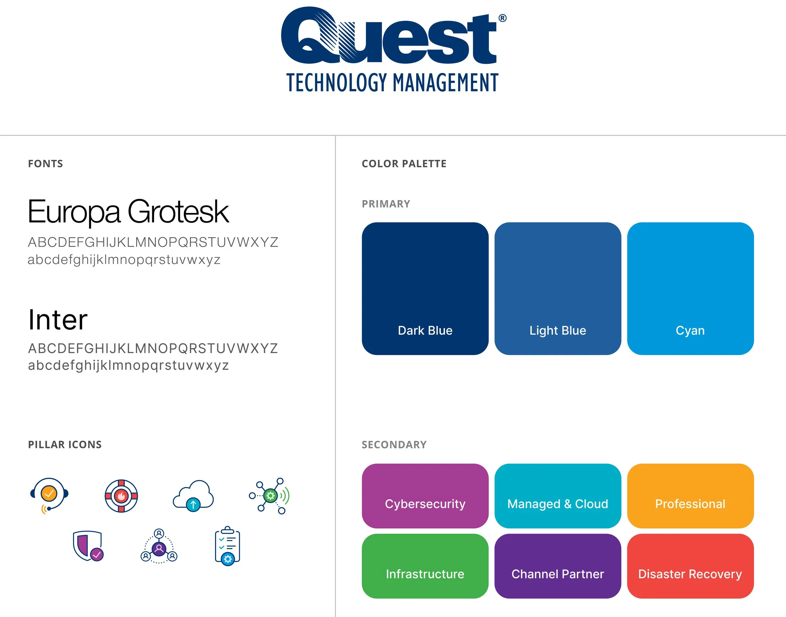
Quest’s previous marketing collateral was informative and expansive but felt outdated. It’s color usage fluctuated without a concise system and lacked denoting shades tied to each pillar service. The family of fonts felt difficult to read in areas of high concentration, especially the pieces that were primarily viewed digitally. Information across important documents and advertisements felt cramped and confined, and deserved more room to highlight Quest’s evolving services.
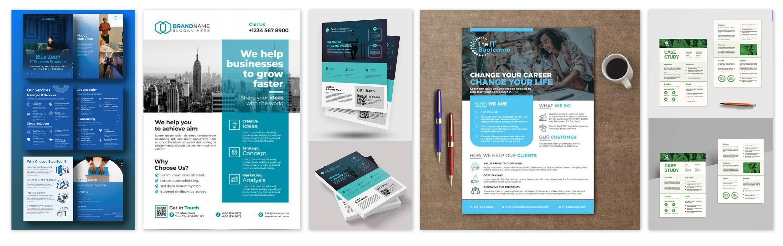
Several sample designs were referenced for inspiration, which helped narrow down the key elements that Quest’s team sought to modify. These included layouts that steered away from segmented blocks of content and towards a fluid, yet refined structure. The objective was to create clear, clean hierarchy with a sophisticated color palette and elegant typography to match.
REFRESH INSPIRATION
The Solution
By redefining their brand guidelines, a fresh, consistent look was streamlined to help inform all collateral pieces, including digital sales sheets, eBooks, case studies, marketing campaigns, and event displays.
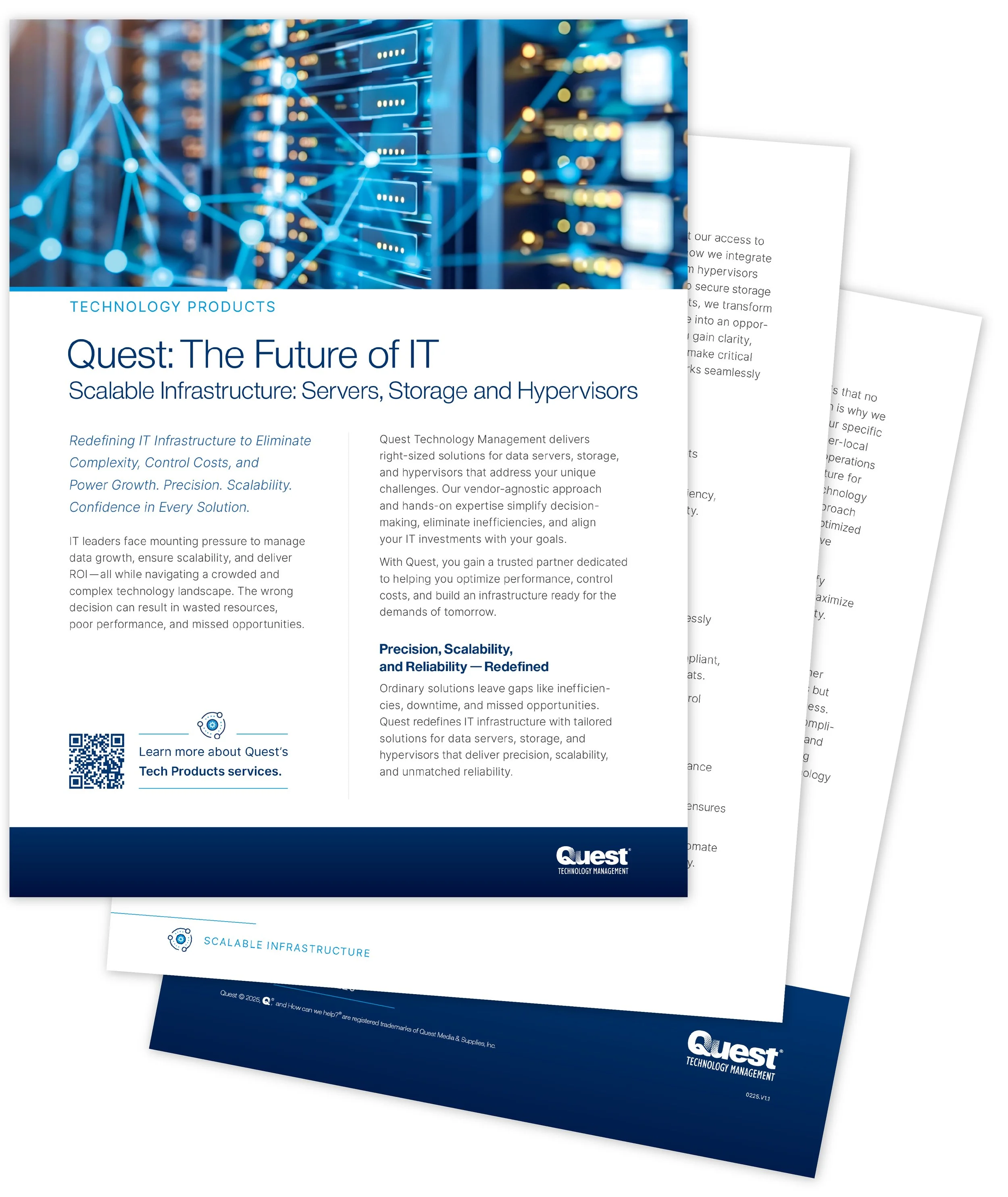
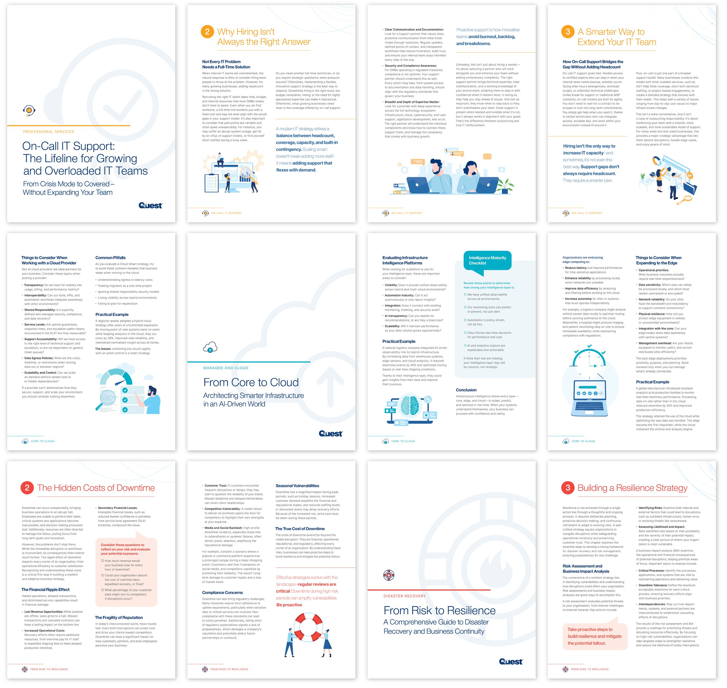
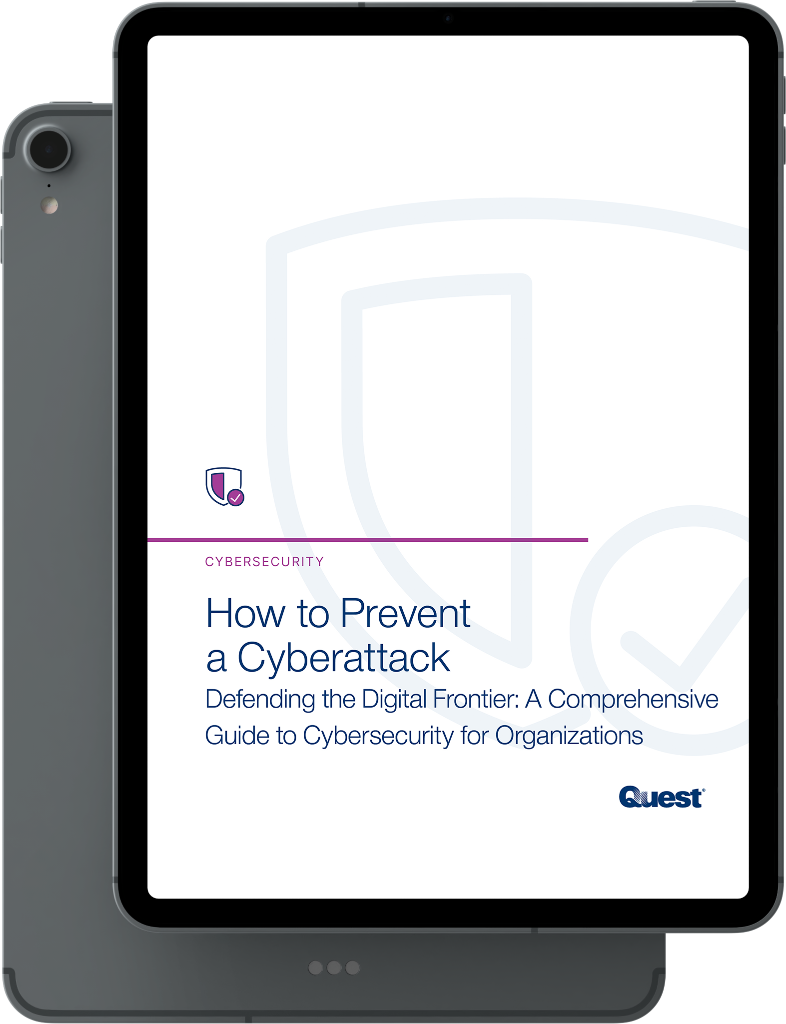
Sales Collateral
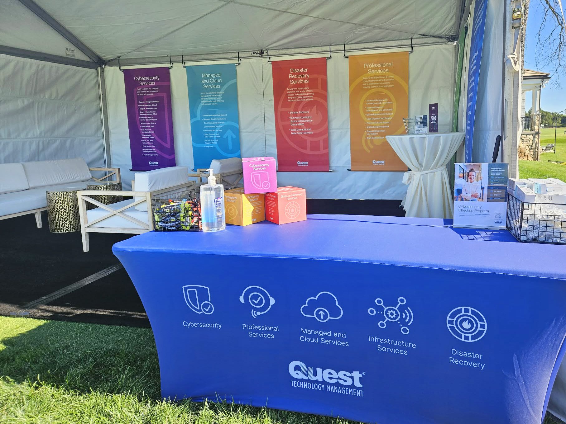
The inclusion of pillar-specific icons and colors guide clients and potential customers through the categorized offerings. Natural and friendlier photography, along with colorized vector illustrations, exemplify Quest’s personalized approach to each customer’s story and unique solutions. Modern type treatments provide improved readability and consistent flow throughout each document.
SALES SHEETS
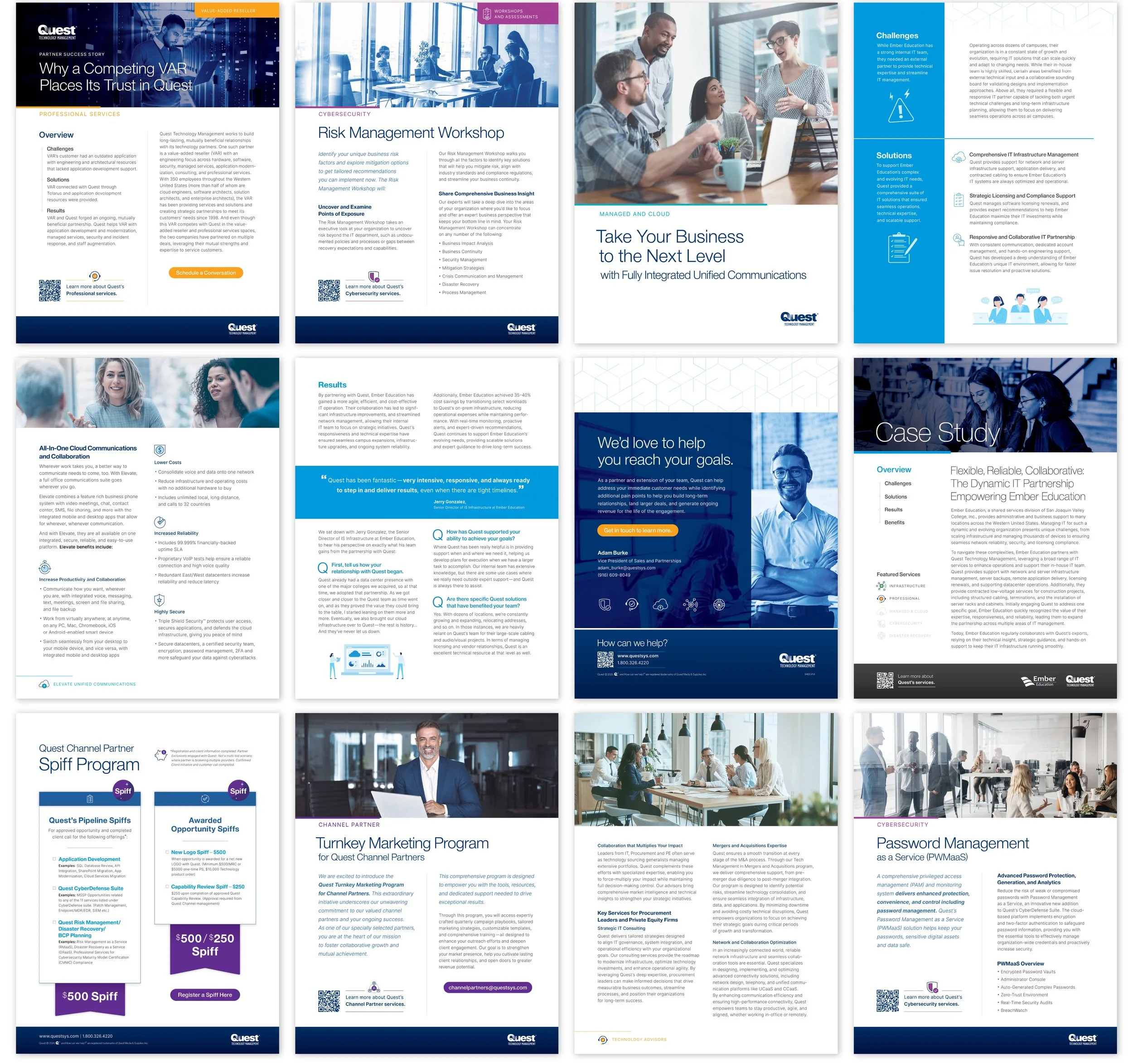
EBOOKS
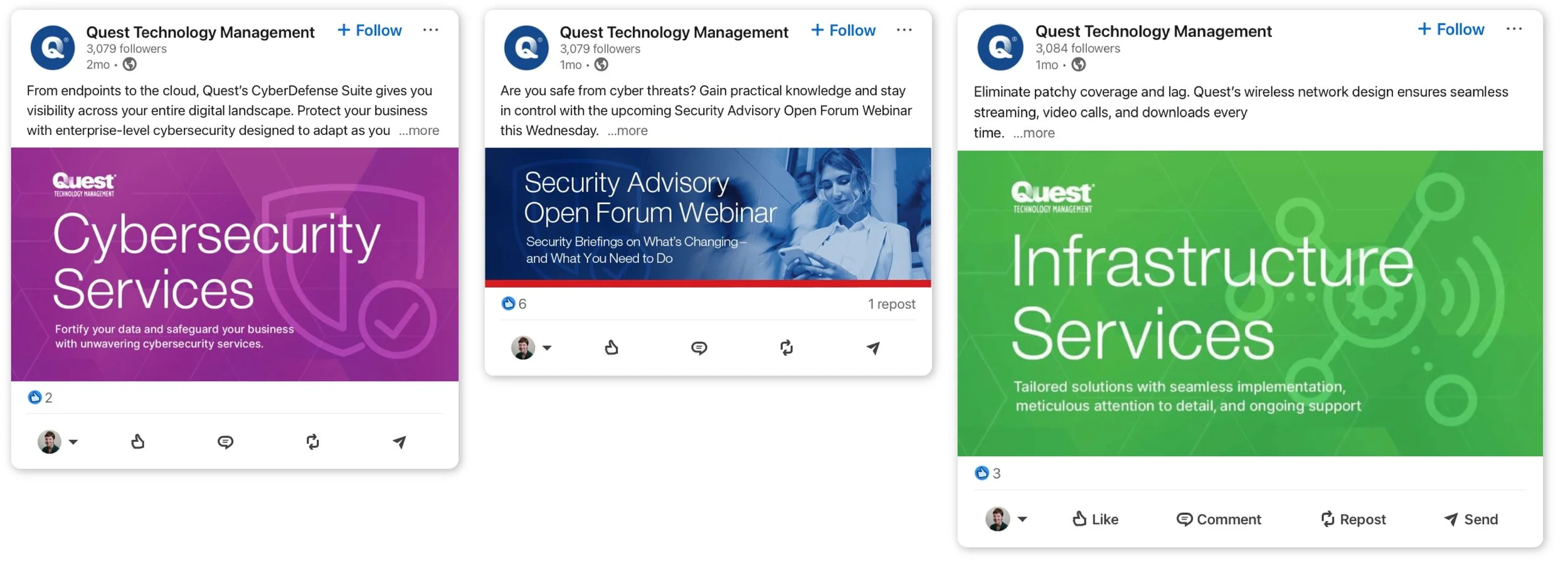
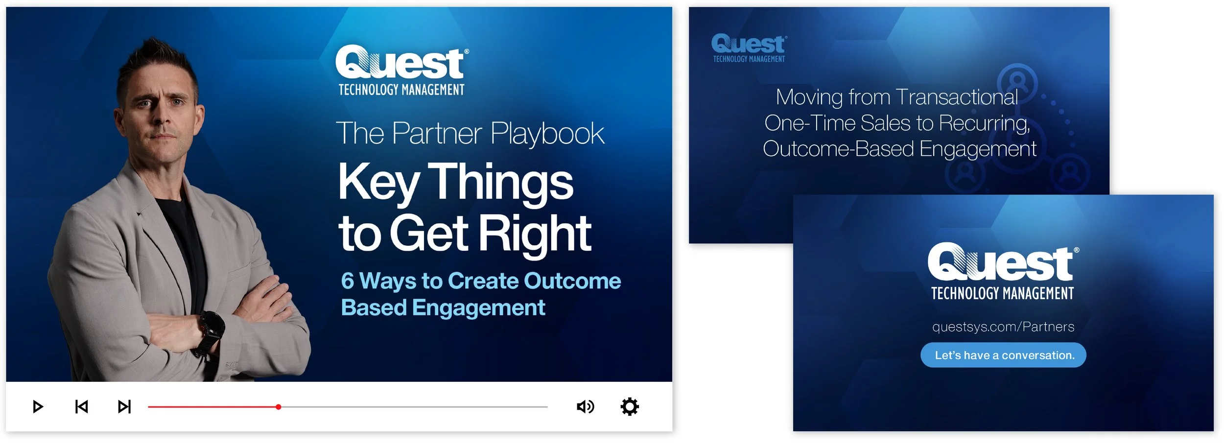
Marketing Campaigns
Color gradients and complimenting patterns accentuate the focus on the company’s technology-based services with a sleek finish. Social media assets are simplified and vibrant, allowing Quest’s insight and expertise to speak boldly. Video thumbnails and transition cards affirm Quest’s vast knowledge and presence in the professional sphere.
SOCIAL GRAPHICS
VIDEO GRAPHICS
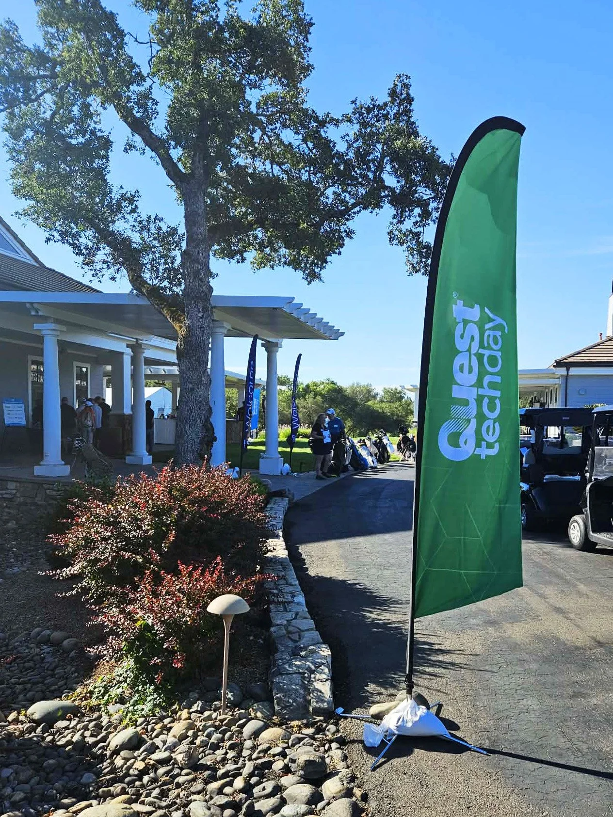
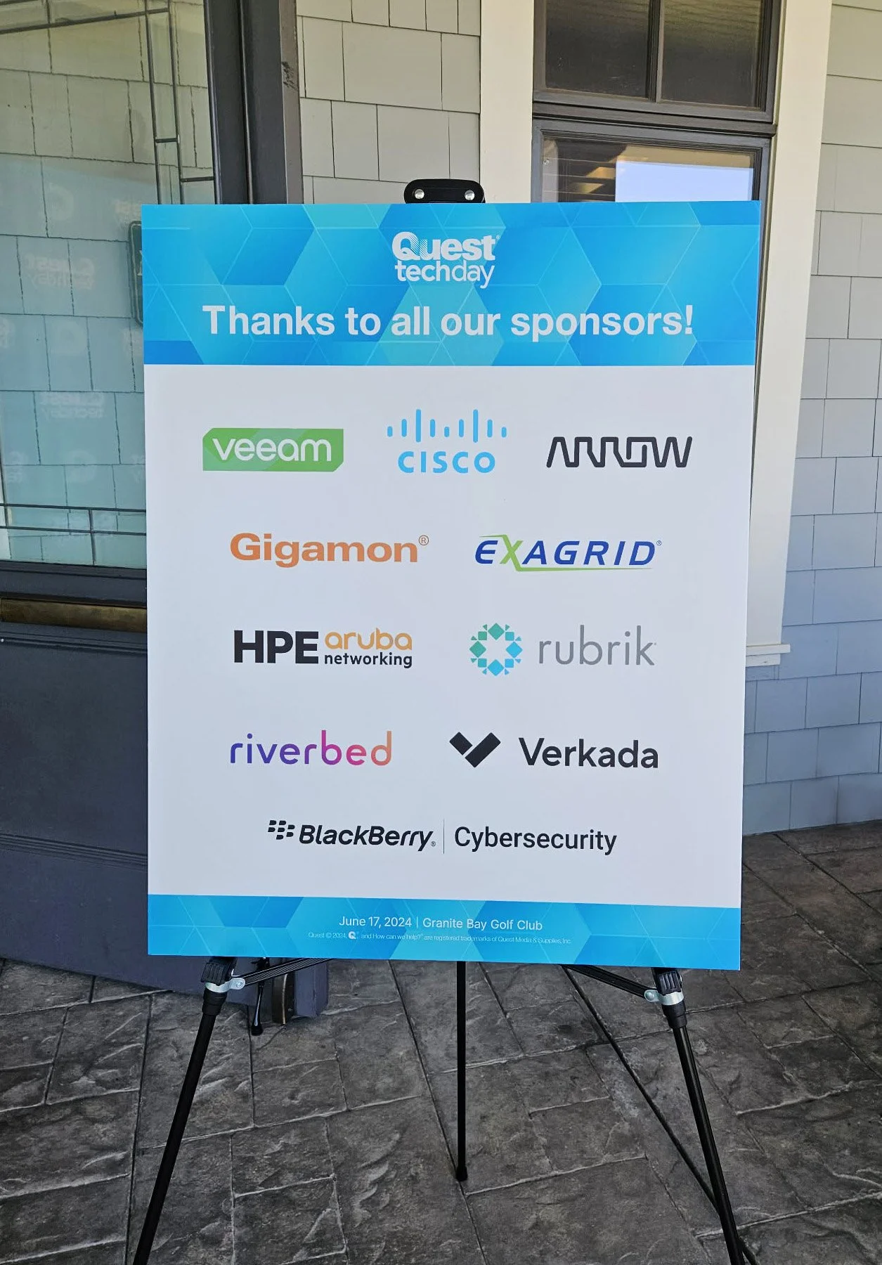
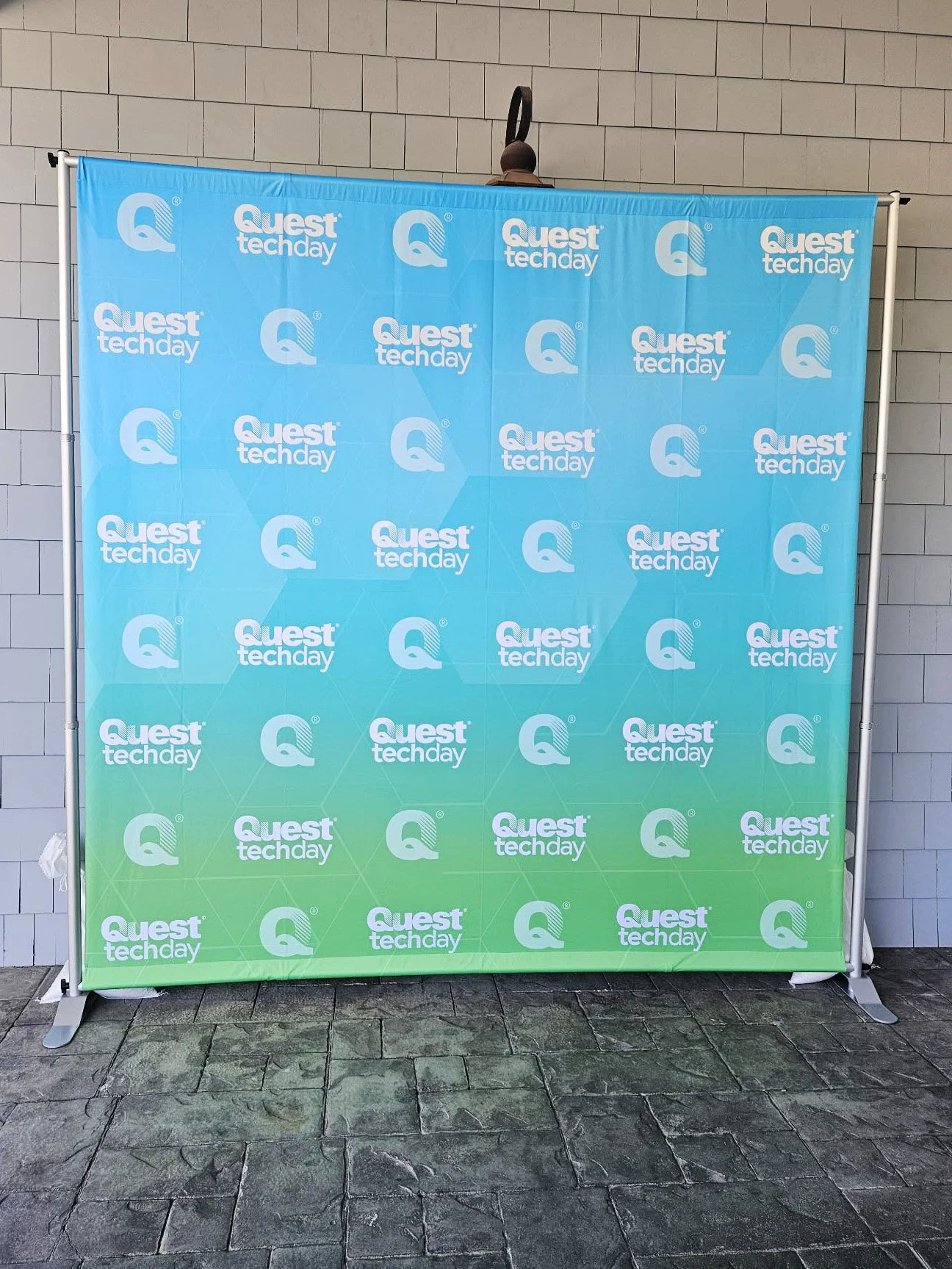
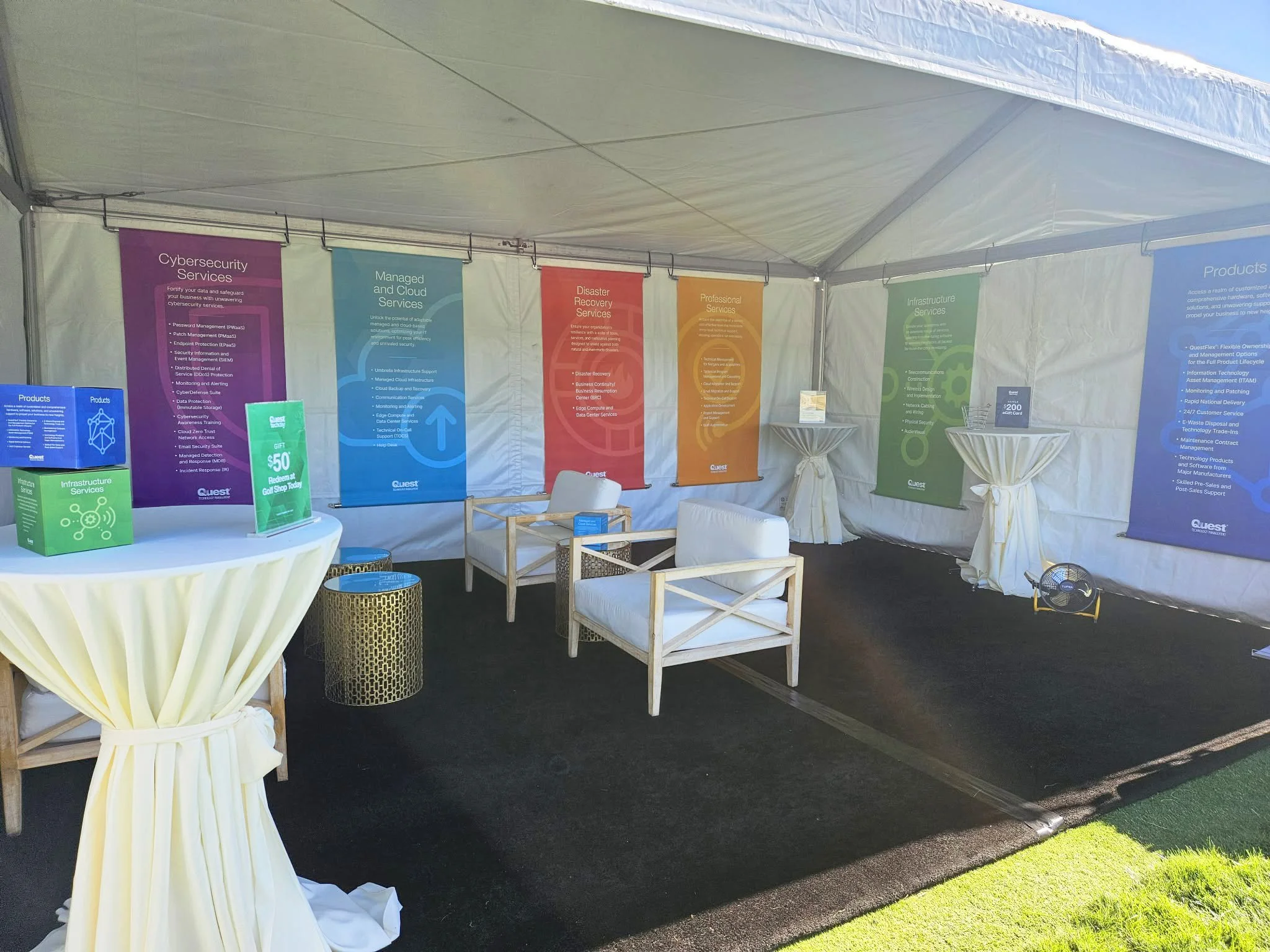
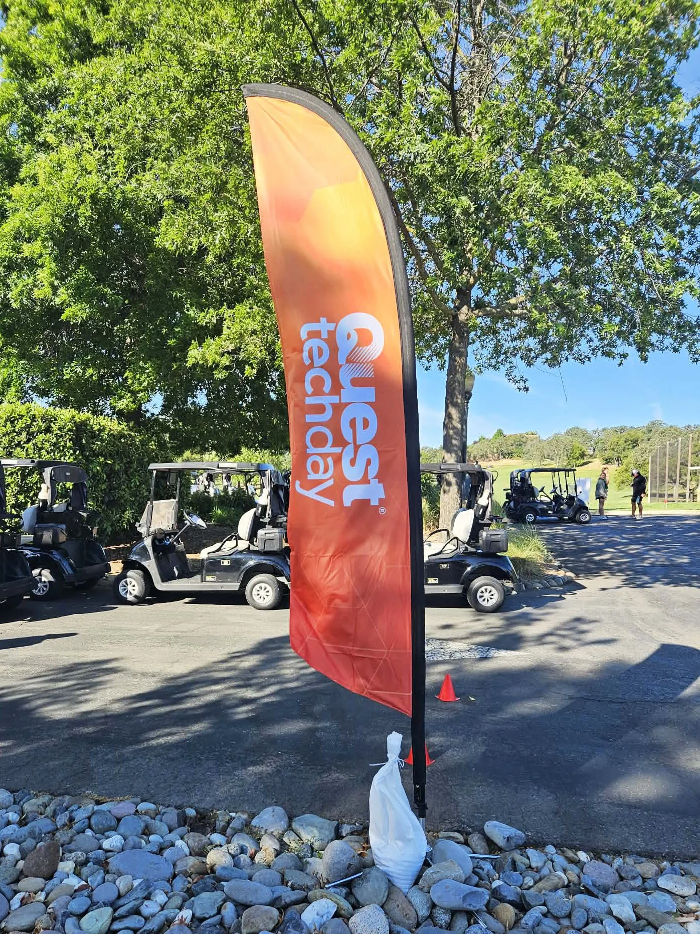
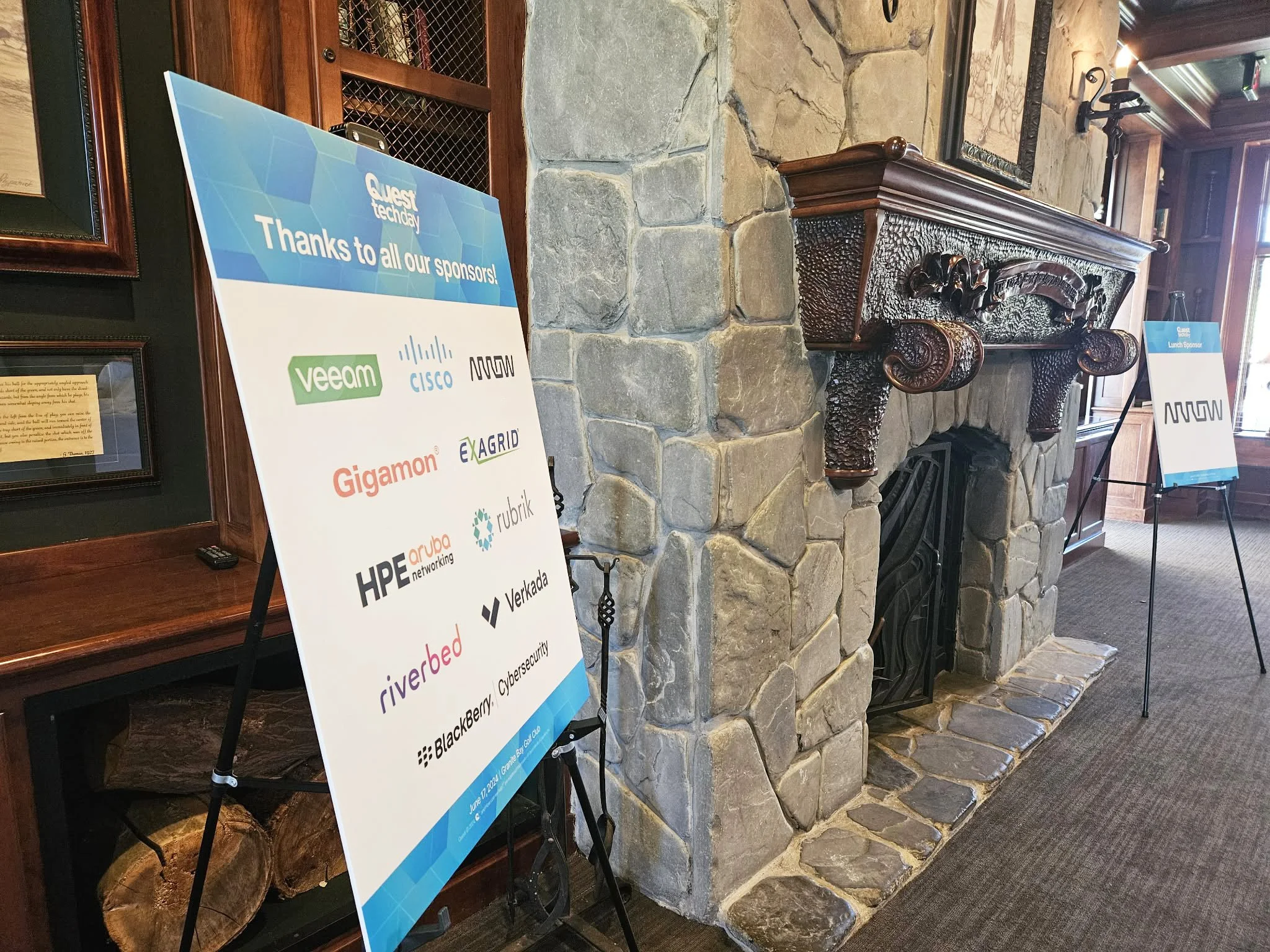
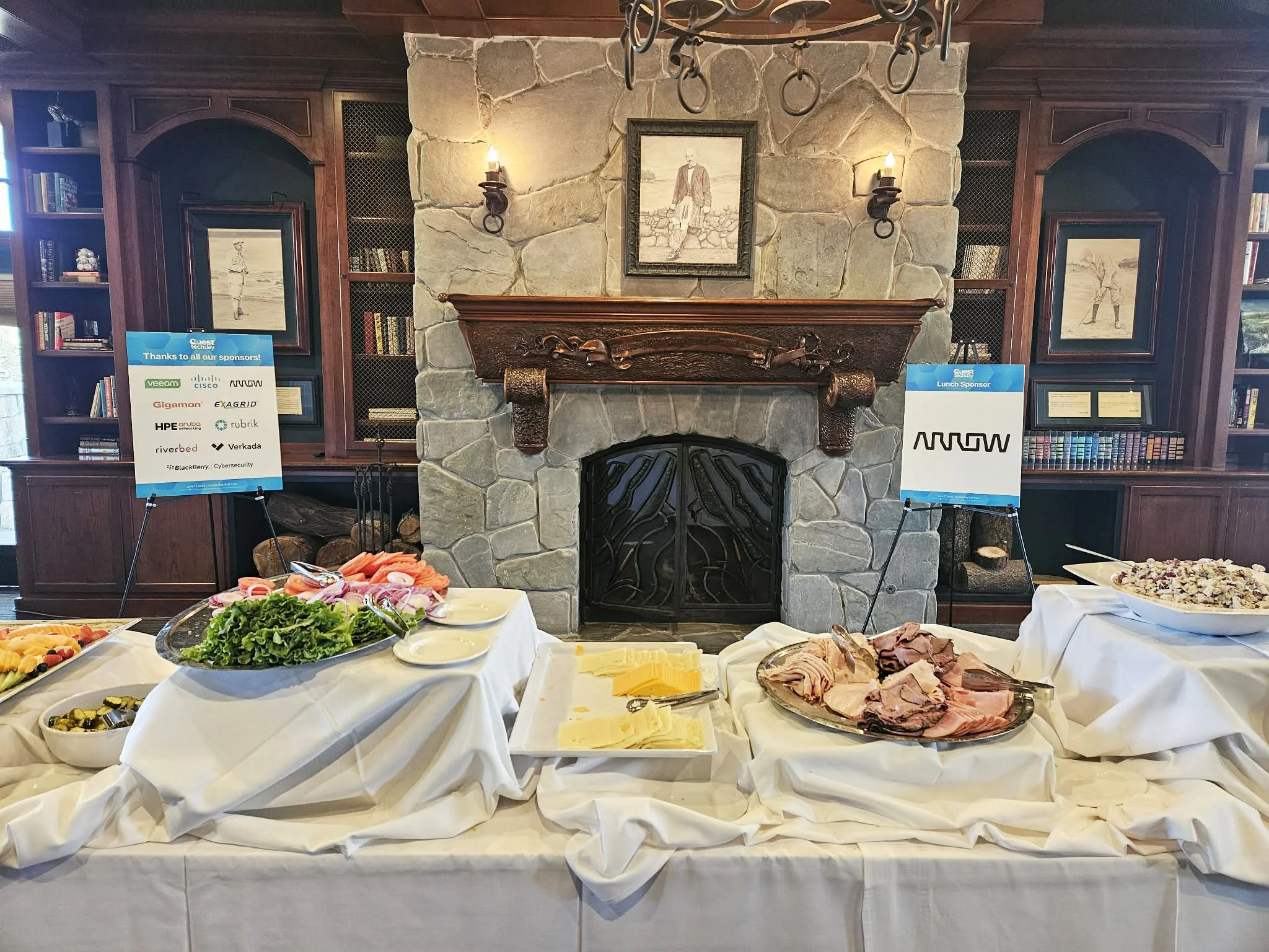
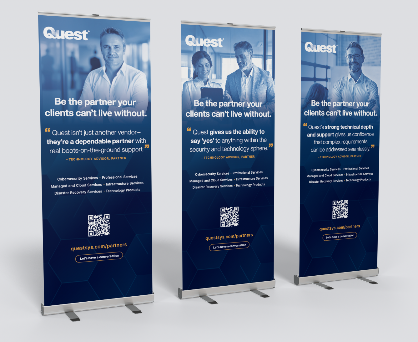
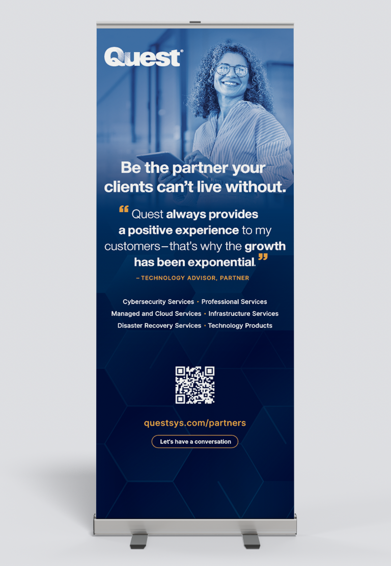
Exhibition Displays
Banners, table covers, and display designs become statement pieces at every event. The repeated hexagon shapes that build into each arrangement symbolize Quest’s fundamental pillars, forming a “building block” foundation. By focusing on their respective audience and experience, Quest is propelled as an educated and reliant source, available to assist with any and all technological needs.
CHANNEL PARTNER BANNERS
TECH DAY 2024