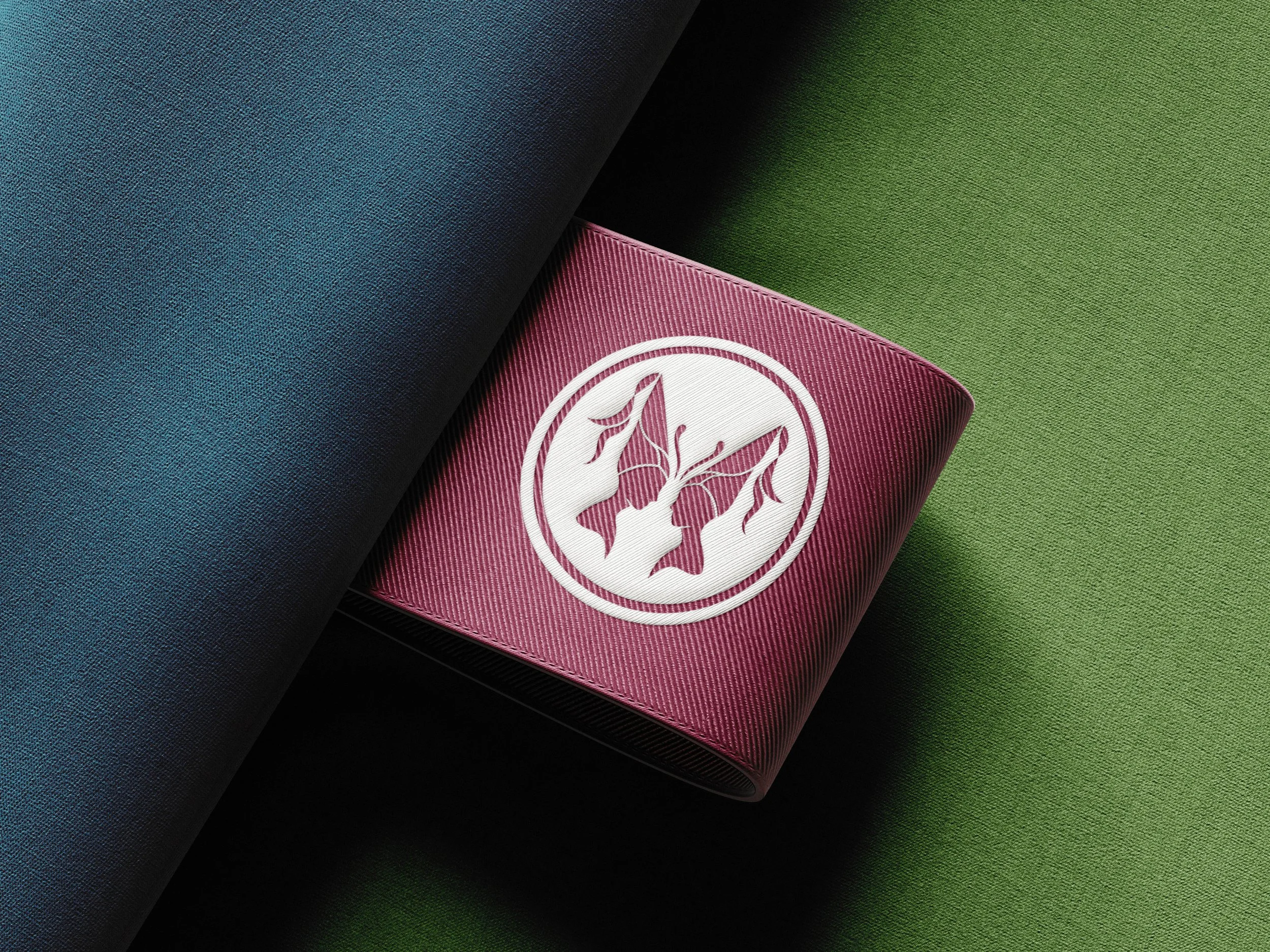
Brand Design
The Horned Harlot is a bespoke shoppe that specializes in handmade Renaissance headwear. Inspired by fantasy themes and theatrical atmospheres, each unique hennin is crafted with meticulous care for all Renaissance Faire “troublemakers”. From soft, elegant satins to bold, striking velvets, there’s a hennin for every fair maiden and menace.
As a new vendor of fantastical headpieces, The Horned Harlot needed a statement piece of its own. And with the anticipation of not only an online shop but also an in-store display, a whimsical yet graceful brand was slated for the center stage.
The Goal
The Horned Harlot required an identity that could live comfortably alongside and stand out against other Renaissance Faire booths and banners. As a rare craft supplier of hennins, the pointed headwear was vital to the symbolic nature of the brand. Historically, hennins and double hennins reflected social status, depending on the height and extravagance of the adornment. Double hennins in particular were worn by those that were deemed “most fashionable” and were referred to as “butterfly hennins” as they symbolized harmony and balance.
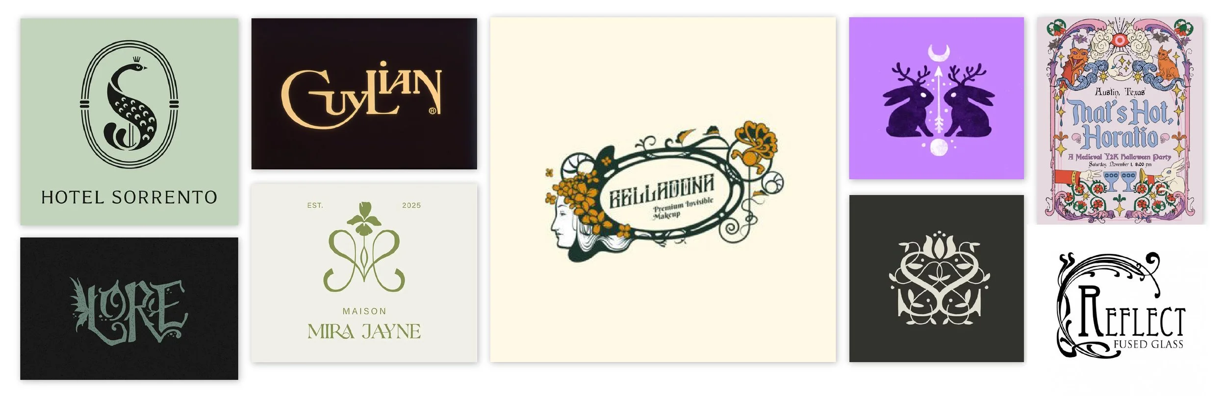
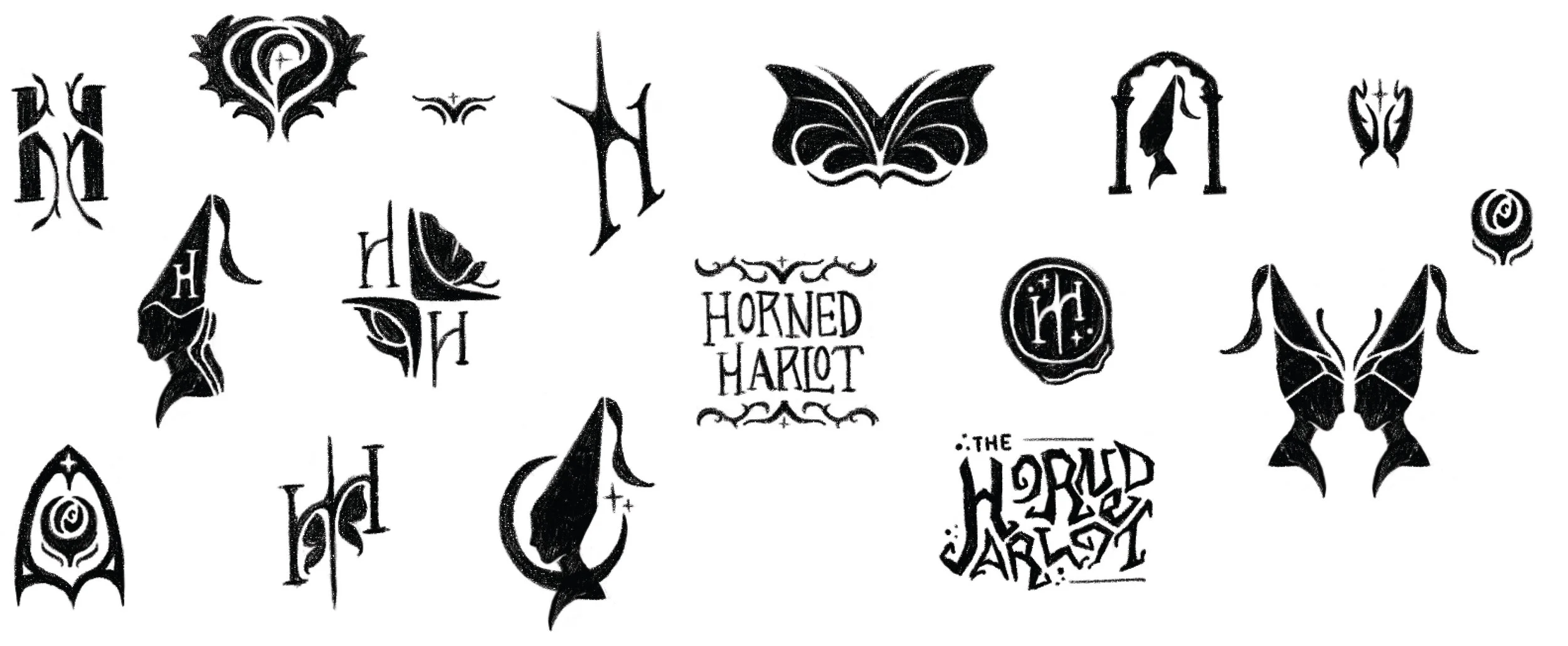
With this in mind, the intent was to incorporate Renaissance iconography with the organic flair of Art Nouveau lettering. The conceptual process ventured down avenues that explored mirrored motifs, expressive asymmetrical typography, and playful interpretations of a “horned harlot”.
VISUAL INSPIRATION
CONCEPT SKETCHES
The Solution
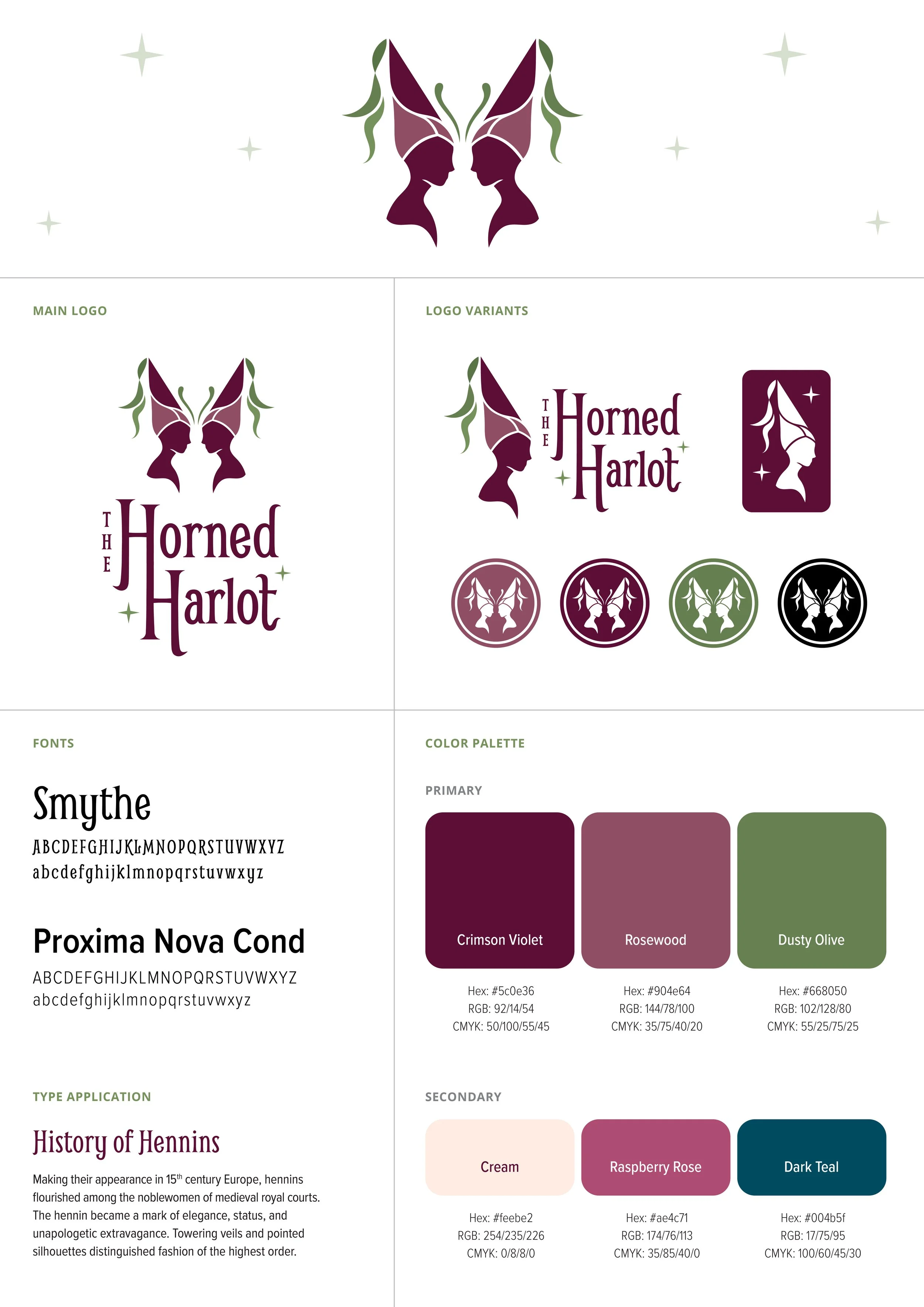
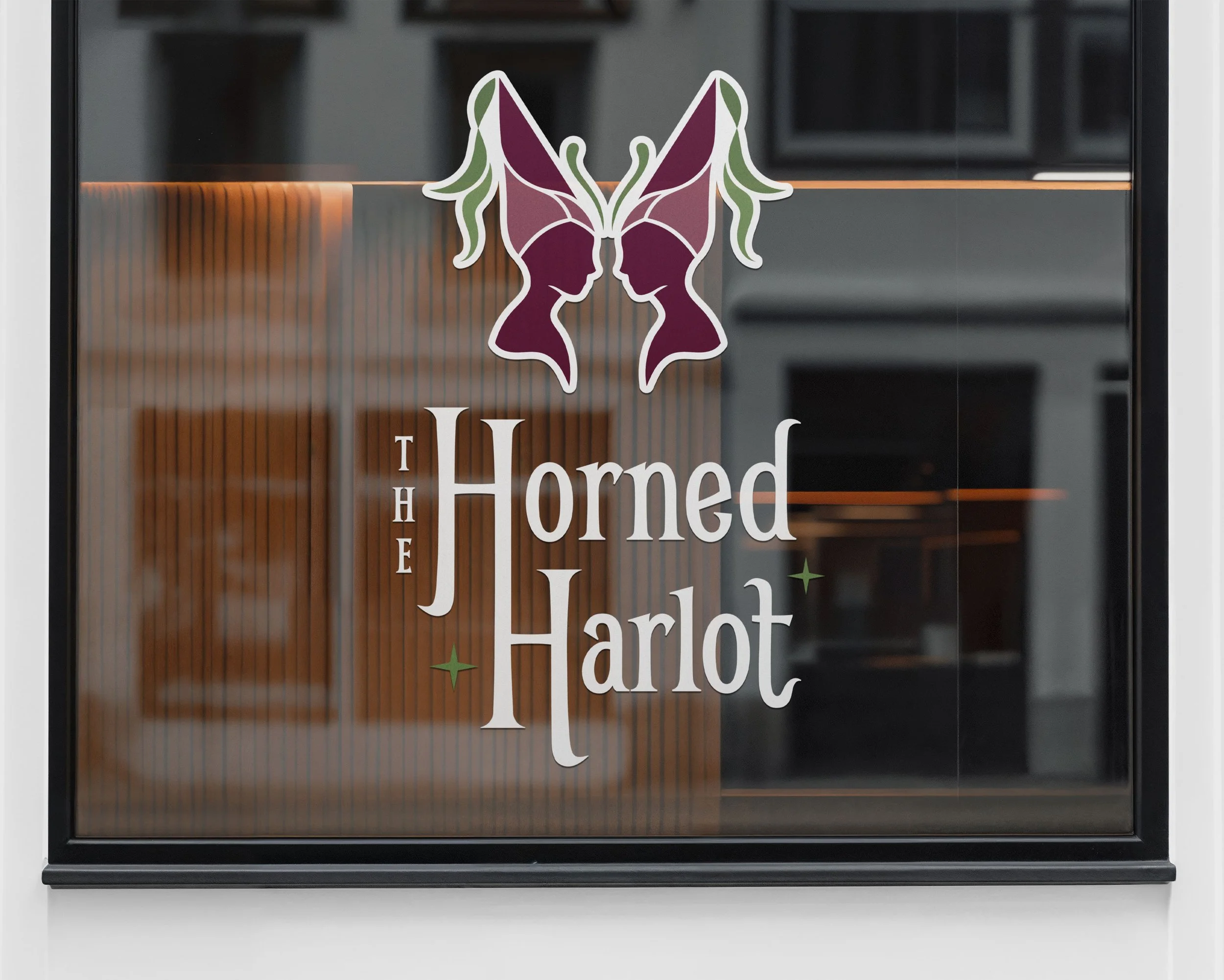
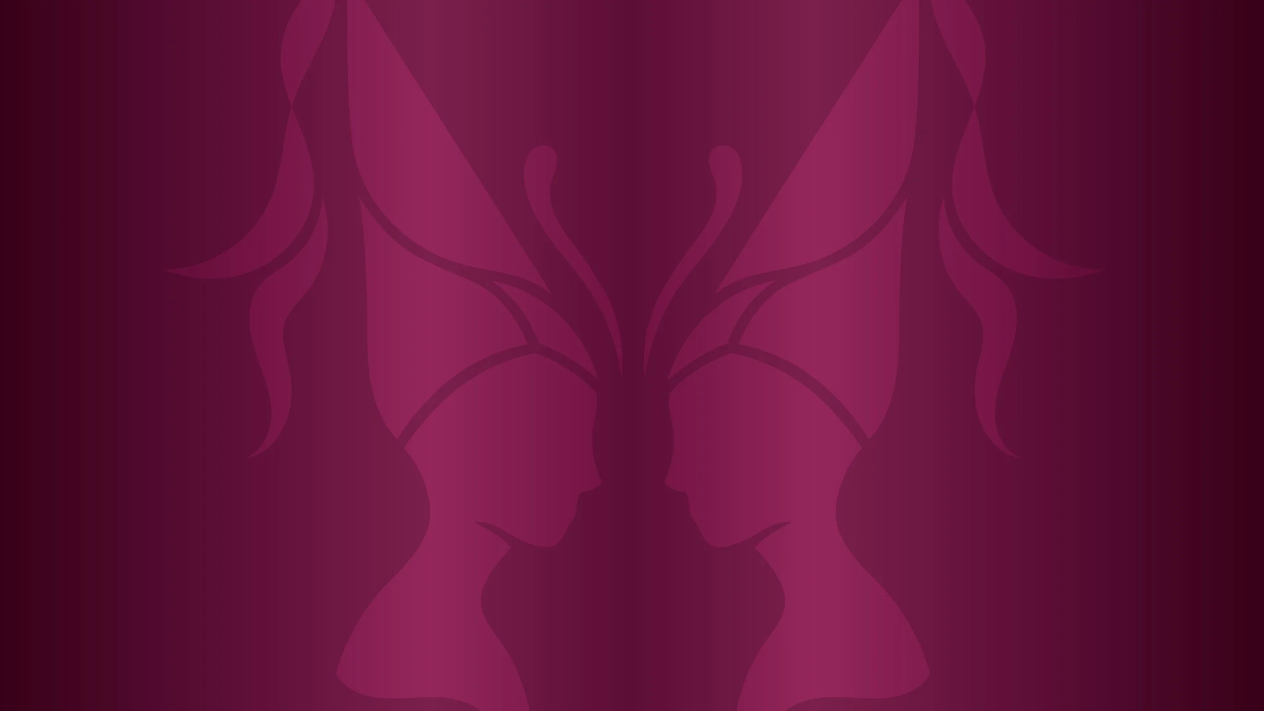
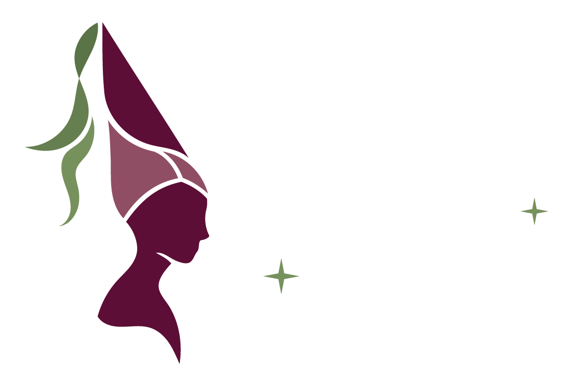
The final mark exhibits elegance with its clean lines and refined forms. Mirrored hennin-adorned silhouettes harmoniously fit together to create a butterfly. The flowing tassels descending from the pointed tops, along with the segmented pieces of the hennins and curvature of the busts, define the unique shape and characteristics of the butterfly’s wings. In its variant style, the butterfly can be separated into a single hennin-adorned form as a more iconic representation of the Renaissance headwear.
A warm wine and muted mauve were selected as the main colors, illustrating the wealth and sophistication of the adorned silhouettes. To complement these tones, an earthy green fills the dangling tassels, butterfly antenna, and accenting sparkles. Smythe stands as the base of the letterforms with some modifications to provide flared edges. The overall composition adopts an asymmetrical arrangement to both offset the balanced mark and cultivate visual intrigue.