Logo Design
As a leader and supporter of the state’s rice growers, California Rice Commission (CRC) has represented the rice industry and its evolving story for generations. Not only are they concerned with the production of rice but also the wildlife affected by ricelands and wetlands throughout various parts of California. CRC promotes news regarding rice growers and their conservation efforts through multiple environmental programs.
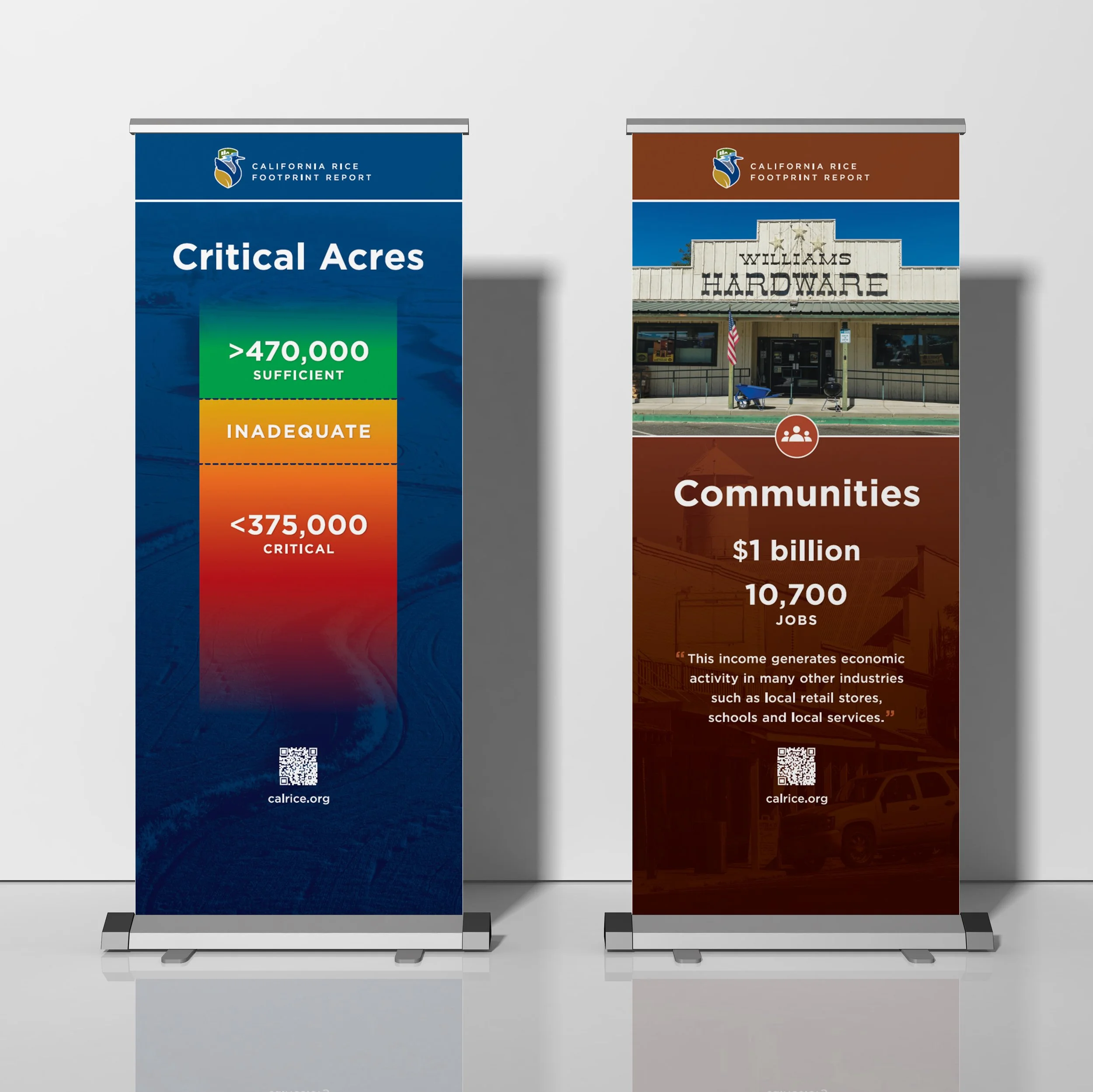
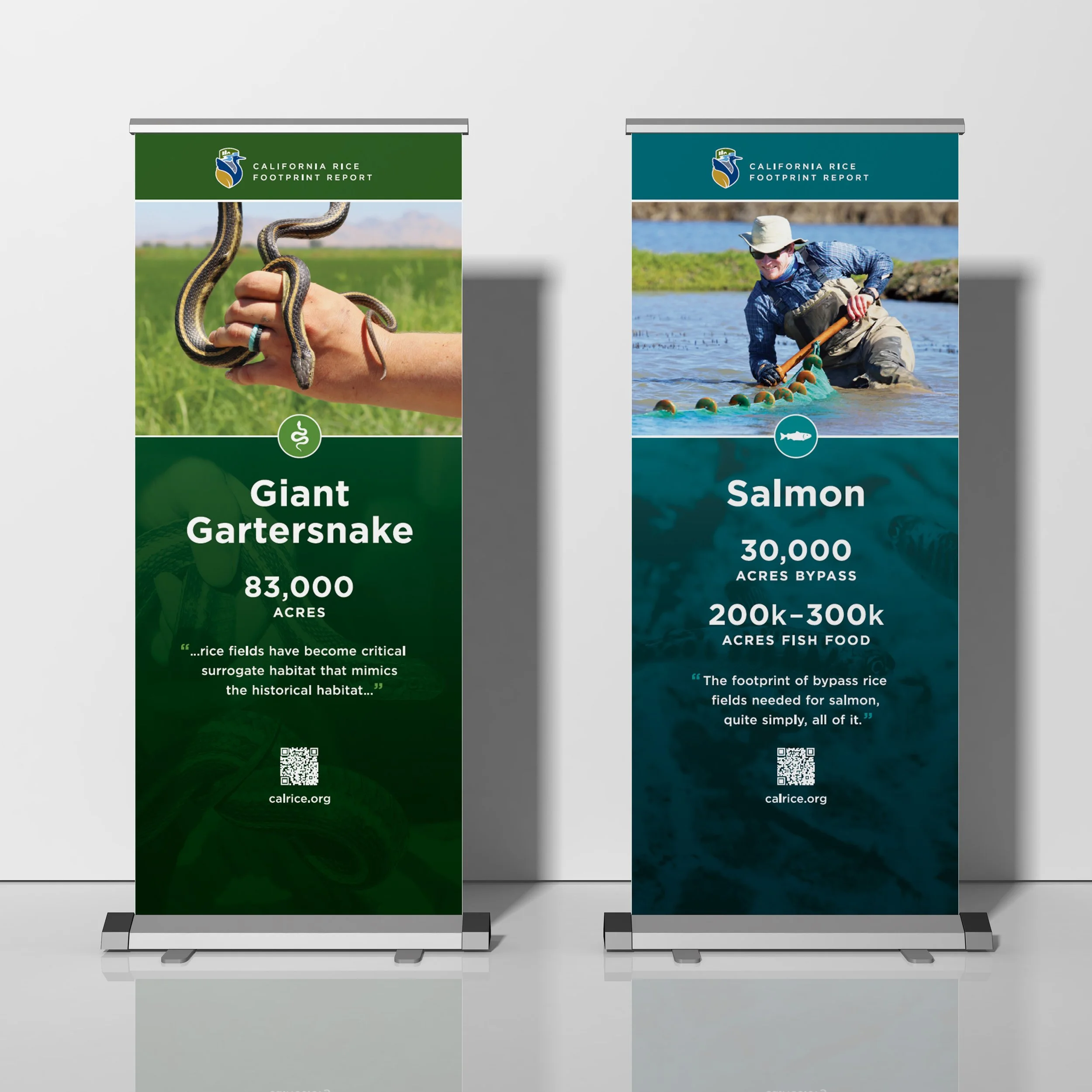
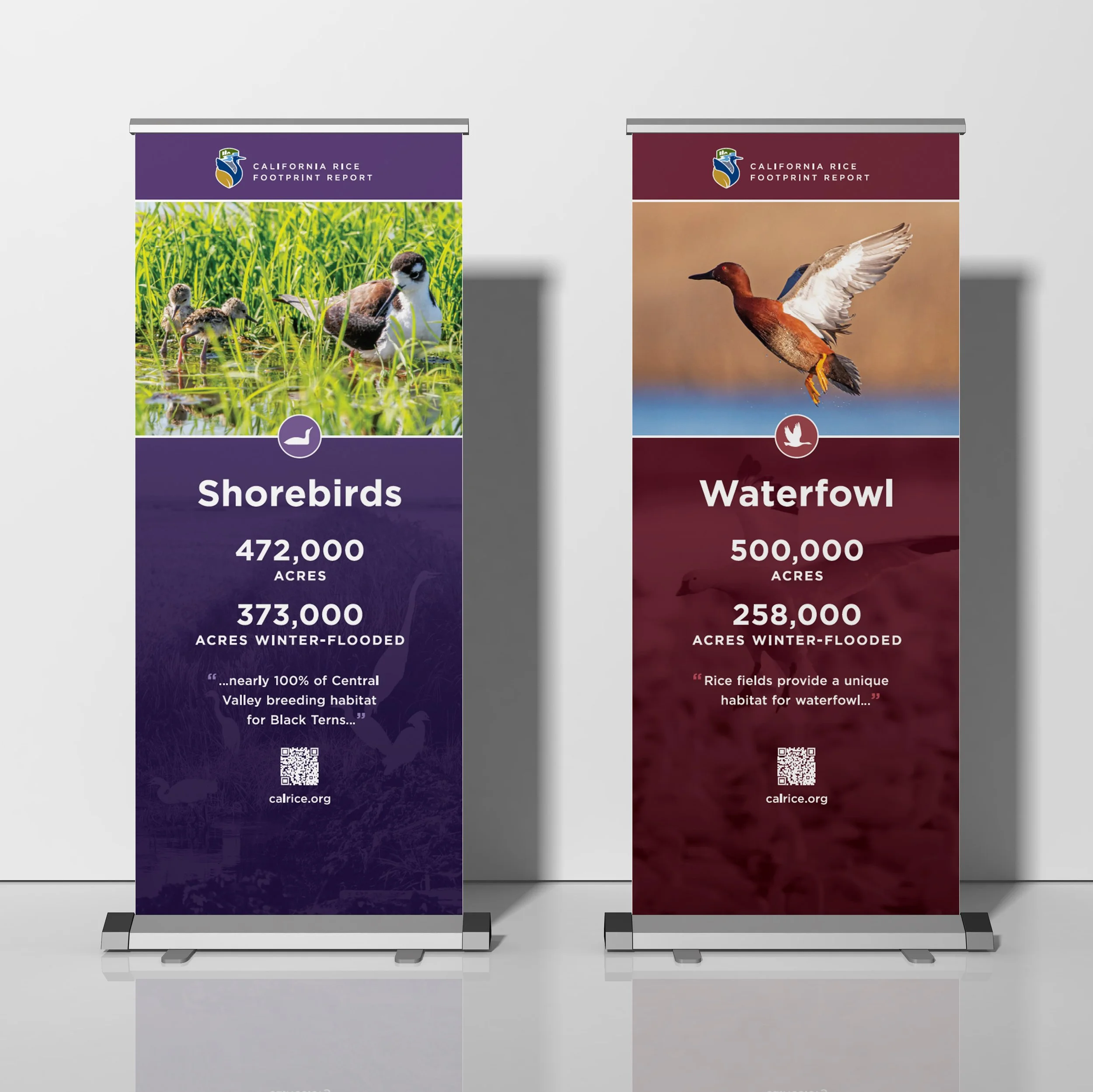
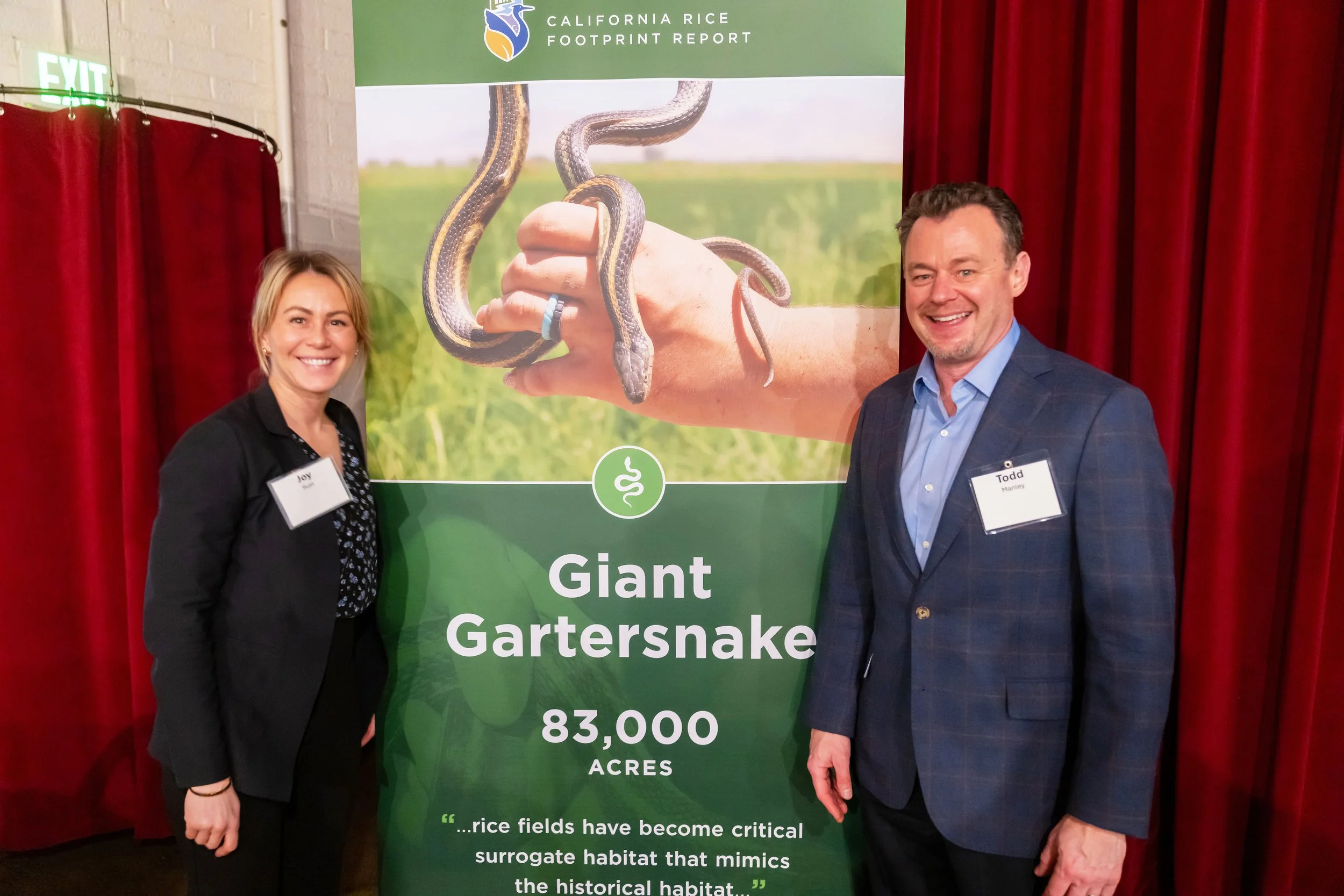
The unveiling of a new comprehensive report (preliminary to the one outlined on the Publication Design study) called for a new logo to represent the impact of the rice footprint within the Sacramento community. A formal dinner to unveil this report and branding was in the books, prompting the additional need for display banners to elevate the event space.

The Goal
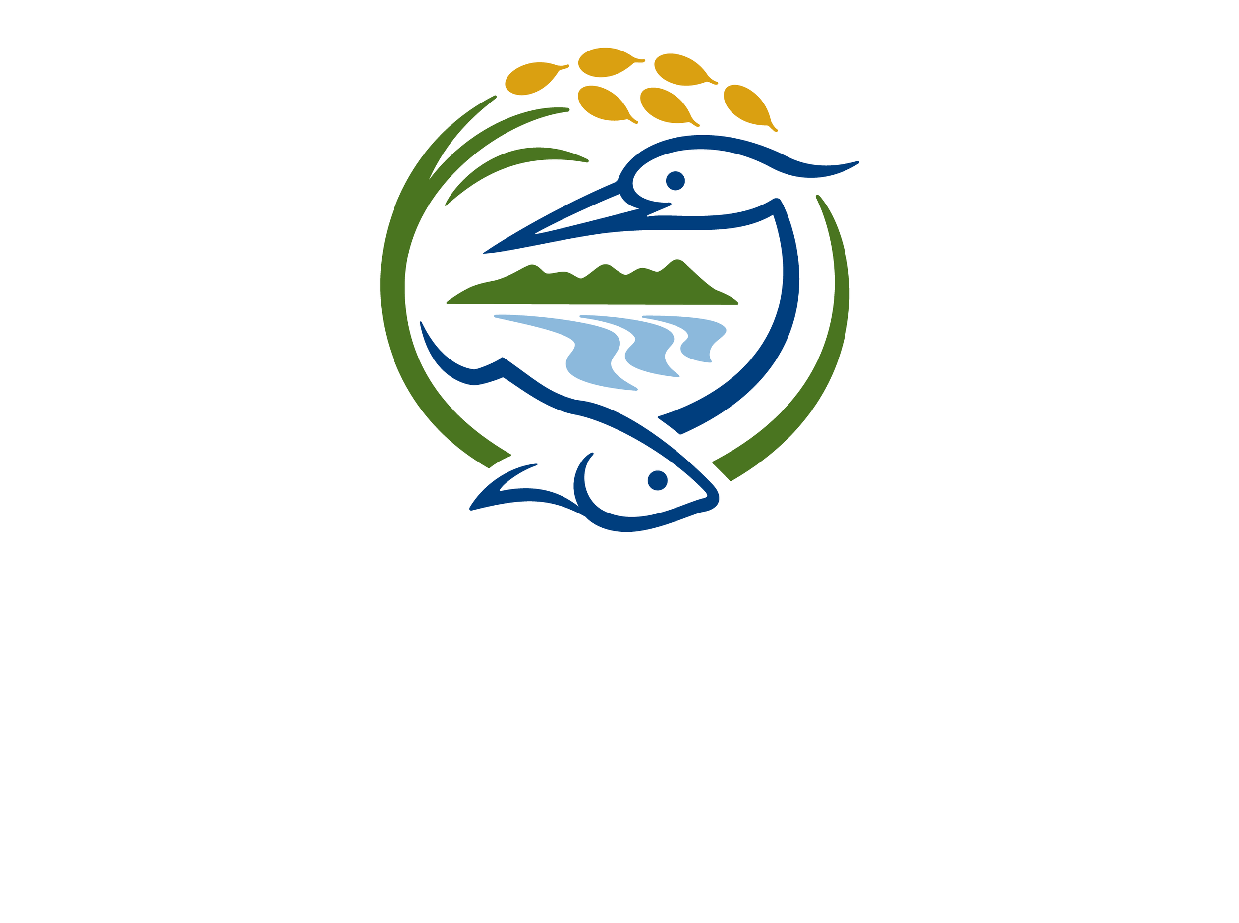
CRC needed a symbol that represented each distinct element that makes up the rice footprint. The land, water, shared resources, and wildlife were all critical components that needed to be highlighted. CRC sought a mark that celebrated the collaboration and partnerships of the involved communities and felt connected to the agricultural valley.
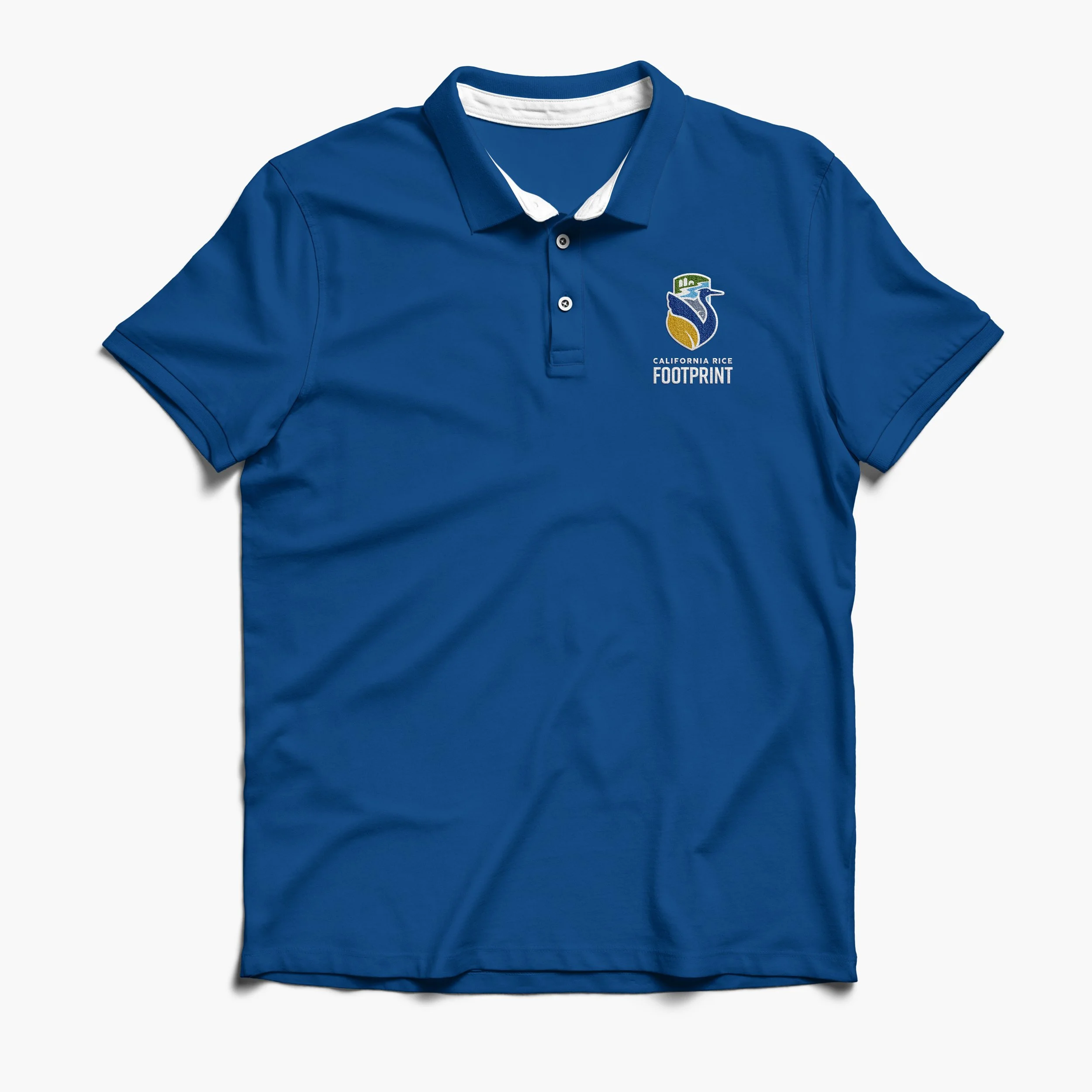
The exploration process delved into many variations of emblems that combined water, farmland, and wildlife. With all of its complexity, it still needed to read as those identifying elements in a single color at a distance. Attempts to craft the composition into that of a wearable pin or badge were explored, keeping possibilities of apparel embroidery in mind.
CONCEPT SKETCHES

The Solution
The finished mark incorporates all components of the rice footprint, intentionally woven together into a proud badge of community and collaboration. Simplified representations of an egret, salmon, and grain of rice stand at the forefront, whilst the ricelands and wetlands are contained neatly above them. Every element cleverly shares space with each other, further cementing the message that each facet of the rice footprint continuously influences all neighboring parts.
Colors were selected from CRC’s brand to intuitively fill each feature (i.e. gold for the rice grain, green for the fields, etc.), ensuring the emblem’s readability at a glance. A combination of typefaces were selected to complete the agricultural symbol—Cocogoose Pro for its rounded edges and Rift for its tall and condensed composition. The polished logo stands as an extension of CRC and how their involvement in wildlife programs, conservation efforts, and the rice grower community are all interconnected.



FOOTPRINT DINNER BANNERS